Creating a custom widget with multi-dimensional data from AIMMS
In the previous tutorial Adding dynamic contents, part II: Simple data from AIMMS we discussed how to create a widget that shows scalar data from AIMMS. In this tutorial we will explain how to create a widget that is populated with multi-dimensional data from AIMMS. To do so, we will first explain the concept of pivoting. Pivoting is essential in multi-dimensional widgets because it allows the user to specify how the widget should deal with the individual domain indices. After that, we explain the handling of the asynchronous data requests. As an example, we will build a simple table widget that will display data from a high dimensional identifier in AIMMS.
Before we begin - Prerequisites
To make the most out of this tutorial, it is important that you meet a couple of prerequisites.
First of all, we are going to assume that you already familiarized yourself a bit with the AIMMS WebUI. Both with the end-usage and the app-development. That you have a recent AIMMS and that you have it running in your set-up.
Since this is a (software) development tutorial, we are also assuming that you have experience in writing software in a generic programming language, and, that you have a basic knowledge on HTML5 technologies (HTML5 DOM, CSS, Javascript, and the likes). It is also beneficial, however not required, if you are familiar with jQuery and, to lesser extent, jQuery UI, as AIMMS WebUI is built on top of these technologies.
More specifically, since we will be creating an HTML table widget, we assume that you are familiar with the basics to create an HTML table.
Finally, since this tutorial uses the concepts that have been introduced in the previous tutorials, we expect that you have completed the previous tutorials (Writing your first custom widget, Adding dynamic contents, part I: Options, and Adding dynamic contents, part II: Simple data from AIMMS) first.
Pivoting
A pivot table usually consists of row, columns and data fields in which the user has freedom to position the labels in the rows or in the columns creating an overview that provides him the most insight. In addition, most pivot tables do support some kind of automatic aggregation of data. Although AWF does have support for automatic aggregation of values, this topic will <b>not</b> be discussed in this tutorial. This tutorial will focus on the freedom of the user to position the element labels where he wants to see them.
The following example further illustrates the concept of the pivoting. Consider the following 3-dimensional data that contains population numbers per sex, age group and year.
Population('0-20', M,2013) = 1,980,278
Population('0-20', F,2013) = 1,890,495
Population('20-65',M,2013) = 5,063,525
Population('20-65',F,2013) = 5,020,932
Population('65+',  M,2013) = 1,263,536
Population('65+',  F,2013) = 1,560,809
Population('0-20', M,2014) = 1,968,124
Population('0-20', F,2014) = 1,877,916
Population('20-65',M,2014) = 5,051,381
Population('20-65',F,2014) = 5,012,844
Population('65+',  M,2014) = 1,314,880
Population('65+',  F,2014) = 1,604,144
When positioning the age group and sex indices in the rows and the year index in the columns, the table will look like:
0-20 |
M F |
1,980,278 1,890,495 |
1,968,124 1,877,916 |
20-65 |
M F |
5,063,525 5,020,932 |
5,051,381 5,012,844 |
65+ |
M F |
1,263,536 1,560,809 |
1,314,880 1,604,144 |
However, when positioning the sex and year indices in the rows and the age group index in the columns, the same data will now look like:
M |
2013 2014 |
1,980,278 1,968,124 |
5,063,525 5,051,381 |
1,263,536 1,314,880 |
F |
2013 2014 |
1,890,495 1,877,916 |
5,020,932 5,012,844 |
1,560,809 1,604,144 |
Also note that the order of the indices may influence the appearance of the table. For example, changing the order of the sex and year indices in the above table will yield the following table:
2013 |
M F |
1,980,278 1,890,495 |
5,063,525 5,020,932 |
1,263,536 1,560,809 |
2014 |
M F |
1,968,124 1,877,916 |
5,051,381 5,012,844 |
1,314,880 1,604,144 |
Partitioning the indices
In the above example every one of the three indices needs to be assigned to either the rows or the columns. In case of a table, the rows and columns can be viewed as the parts. In a GanttChart, parts like resources (to specify the resource rows to be rendered) and jobs (to specify what indices to be used to color the bars) would probably make more sense.
In general, an index partition can be defined as a partition of m indices into n parts. Pivoting is the process that results in an index partition.
Pivoting support has been implemented as a generic AWF option editor that is available for widget developers. Pivot support is automatically added to a widget whenever the pivotable contents property tag has been specified in the widget’s factory. The simple table widget that will be created later in this tutorial will illustrate this.
In addition to using the pivotable contents property tag,
Extending a widget with pivoting support
AWF has built-in pivoting support that can be added to a widget by adding the pivotable contents property to a widget. Doing so, the widget will be extended with a pivot option editor that helps the user specify the partition.
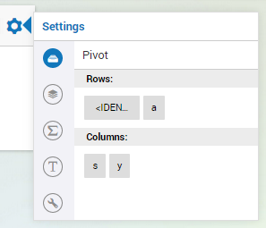
The pivot editor in figure 1 shows four indices. In addition to the domain indices of the identifier (which, in figure 1 are the a (age-groups), s (sex) and y (year) indices, the pivot option editor also shows the <IDENTIFIER-SET> index which allows the user to control the position of the identifier title in the widget. This index is always added by AWF and is specially useful in case the widget displays data of more than one identifier (with potential different index domains). In this tutorial we will only display a single identifier in a widget.
Datasources, parts and values
By selecting a single row in each part of the datasource, all indices will have a fixed value, which uniquely identifies a single value in the datasource.
The data that is associated with a datasource can be divided into two groups:
Data that represents the labels of the indices in the parts. For every part, a 2-dimensional datablock is available that provides these labels though a
get(r,c)interface. The number of columns in this structure is equal to the number of indices assigned to the part. The number of rows in this structure is determined by the combination of labels (for the indices that play a role) for which the identifier in the AIMMS model contains data. The row header in the table widget can be viewed as mental representation of the 2-dimensional structure associated with the rows part.Data that represents the actual values of the identifier. To access these data, an n (where n is the number of parts) dimensional datablock is available that provides the values through a
get(r1,r2,...,rn)interface (where r1 refers to row number r1 in the first part, etc.
Asynchronous data retrieval
Whenever the option type of the contents has the JavaScript type property “datasource”, its resolved value will be an AWF datasource object. The AWF datasource object has a requestDataBlocks method that should be used to request data in an asynchronous manner. The 3rd arguments of this function is a callback function that will be called when the requested data is available. For example, consider a datasource with two parts named rowHeader and colHeader. To retrieve the data for both parts as well as for the resulting grid area, the following JavaScript statement can be used:
dataSource.requestDataBlocks(
    [
        {start: 0, end: dataSource.values.getNumRows()},
        {start: 0, end: dataSource.values.getNumCols()},
    ],
    ["values"],
    function onReady(dataBlocks) {
        ['rowHeader', 'colHeader', 'values'].forEach(function(type) {
            var partDataSource = dataSource[type];
            _.times(partDataSource.getNumRows(), function(row) {
                _.times(partDataSource.getNumCols(), function(col) {
                    console.log('The value in cell ( '+ row + ',' + col +
                                ') of the ' + type + ' part is '+
                                dataBlocks[type].getLayer("values").get(row, col));
                });
            });
        });
    }
);
Simple table factory
As mention in Writing your first custom widget you typically start with creating a widget factory. The widget factory for the simple table looks like:
(function($) {
// factory.js
var OptionTypeTable =
{
    type : "datasource",
    parts : [ {name : "rowHeader"}, {name : "colHeader"} ],
};

AWF.Bus.subscribe({

    onCollectTypes: function(collectedTypes, contextElQ) {
        if(!contextElQ || contextElQ.awf.tags("placeable-widget-container")) {
            collectedTypes.push("my-table-widget");
        }
    },

    onInitializeTags: function(elQ, type) {
        if(type === 'my-table-widget') {
            elQ.awf.tags(["placeable", "pivotable contents property", "my-table-widget"], 'add');
        }
    },

    onInitializeOptionTypes: function(elQ, type) {
        if(type === 'my-table-widget') {
            AWF.OptionTypeCollector.addOptionType(elQ, "contents", OptionTypeTable);
        }
    },

    onDecorateElement: function(elQ, type) {
        if(type === 'my-table-widget') {
            elQ.aimms_my_table();
        }
    },
});

})(jQuery);
When using the widget factory, AWF will contribute several option editor to the widget that help the user specifying the option values. In addition to the Miscellaneous option editor and the Advanced option editor that have been discussed in previous tutorials, the table widget in this tutorial will be extended with three more option editor:
A contents editor, indicated by the
 icon,
that will provide the user of the widget with an alternative and convenient way to select the
identifier to be shown in the widget. The contents option editor shows the contents
of a widget that shows data of the Population identifier.
icon,
that will provide the user of the widget with an alternative and convenient way to select the
identifier to be shown in the widget. The contents option editor shows the contents
of a widget that shows data of the Population identifier.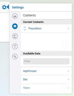
A totals editor, indicated by the
 icon,
that is automatically added by AWF whenever you create a widget that has a contents option of
type datasource. The totals editor however will not be discussed in this tutorial.
A pivoting option editor, indicated by the
icon,
that is automatically added by AWF whenever you create a widget that has a contents option of
type datasource. The totals editor however will not be discussed in this tutorial.
A pivoting option editor, indicated by the  icon,
that is added as a result of using the pivotable contents property tag. The pivot option
editor was already shown in figure 1.
icon,
that is added as a result of using the pivotable contents property tag. The pivot option
editor was already shown in figure 1.
Creating the widget source file
To create the source file for the widget, you should create a JavaScript source file in the same folder as the factory file with the following structure
(function($) {

var MyTableWidget = AWF.Widget.create({

    _create: function _create() {
        // TODO
    },

    _createHtmlTable: function _createHtmlTable(rowHeaderDimension,colHeaderDimension) {
        // TODO
    },

    _fillTable: function _fillTable(dataSource) {
        // TODO
    },

    _refresh: function(dataSource) {
        // TODO
    },

    onResolvedOptionChanged: function(optionName, value) {
        // TODO
    },
});
// The jQuery-UI way of registering/creating a new widget:
$.widget('ui.aimms_my_table', MyTableWidget);

})(jQuery);
The individual methods in this file will be discussed in the remainder of this tutorial.
Creating the widget container
_create: function _create() {
    var widget = this;

    widget.tableContainerElQ = $('<div></div>');
    widget.tableElQ = $('<table>');

    widget.tableContainerElQ
        .append(widget.tableElQ);

    widget.element.find('.awf-dock.center')
        .append(widget.tableContainerElQ);
}
The above _create function creates an empty DOM container element, that is appended to the widget’s element that has already been created by AWF. The empty container object is used later on to fill it with addition DOM elements that will render the actual table widget. This cannot be accomplished during creation of the widget, because, at that time, the option values and data is not yet available. Using a humble _create that just creates an empty container element to be used later on, is a typical pattern that is often used when creating AWF widgets.
Handling content option changes changes
Content option changes are triggered by AWF whenever the user changes the specified value of the option at hand (e.g. by selecting an identifier using the option editor), and/or whenever the data of the underlying AIMMS identifier changes. Depending on the widget this may require a complete redraw of the widget.
Because a data change may require a change in the dimensions of the table, it is easier to recreate the HTML from scratch ever time, instead of trying to figure out whether the data change is a structural change (i.e. a change that involves a change in the dimensions of the table), or just the change of a simple number.
Whenever the user empties the contents option, the widget will receive a resolved option change with value undefined. For this reason, you should make sure the refresh function will be able to deal with this situation.
onResolvedOptionChanged: function(optionName, value) {
    var widget = this;
    if(optionName === "contents") {
        widget._refresh(value);
    }
}
Refreshing the table
In this tutorial, we will refresh the table by
redrawing the HTML from scratch
requesting all data from the dataSource
upon retrieval of the data, the empty table will be filled with the data
The _refresh function below takes care of this.
_refresh: function(dataSource) {
    var widget = this;

    var rowHeaderDimension = { numRows:0, numCols: 0 };
    var colHeaderDimension = { numRows:0, numCols: 0 };

    if(dataSource) {
        rowHeaderDimension = { numRows:dataSource.rowHeader.getNumRows(),
                               numCols:dataSource.rowHeader.getNumCols() };
        colHeaderDimension = { numRows:dataSource.colHeader.getNumCols(),
                               numCols:dataSource.colHeader.getNumRows() };
    }

    widget._createHtmlTable(rowHeaderDimension, colHeaderDimension);
    widget._fillTable(dataSource);
}
Creating the HTML table
The _createHtmlTable function below creates an empty HTML that gives the table the dimensions that are provided in the arguments. The function uses standard JavaScript and jQuery functions to create an HTML table. Every cell in the table will be decorated with some extra CSS classes to indicate the part (rowHeader, colHeader or values) and the position of the cell within the part (for example row3 and col2). These CSS classes can be used later on to style the table to your liking.
_createHtmlTable: function _createHtmlTable(rowHeaderDimension,colHeaderDimension) {

    var numRowsInRowHeader = rowHeaderDimension.numRows;
    var numColsInRowHeader = rowHeaderDimension.numCols;
    var numRowsInColHeader = colHeaderDimension.numRows
    var numColsInColHeader = colHeaderDimension.numCols;

    // Helper function to create table cell 'th' or 'td' element with extra classes
    // For example, createCellElQ('th', 'foo', 3, 4) ==> '<th class="foo row3 col4"></th>'
    function createCellElQ(type, name, row, col) {
        return $(['<', type, ' class="', name, ' row'+row, ' col'+col, '"></', type, '>'].join(''));
    }

    // Step 1: Create the column header
    var theadElQ = $('<thead>');
    _.times(numRowsInColHeader, function(col) {
        var trElQ = $('<tr>');
        _.times(numColsInColHeader, function(row) {
            trElQ.append(createCellElQ('th', 'colHeader', row, col));
        });
        theadElQ.append(trElQ);
    });

    // Step 2: Add the pivot area, i.e. the 'empty' block in the upper-left corner of the table
    theadElQ.find('tr:first').prepend('<th colspan="'+numColsInRowHeader+'" rowspan="'+numRowsInColHeader+'"></th>');

    // Step 3: Create the row header and grid
    var numColsInGrid = numColsInColHeader;
    var tbodyElQ = $('<tbody>');
    _.times(numRowsInRowHeader, function(row) {
        var trElQ = $('<tr>');
        _.times(numColsInRowHeader, function(col) {
            trElQ.append(createCellElQ('th', 'rowHeader', row, col));
        });
        _.times(numColsInGrid, function(col) {
            trElQ.append(createCellElQ('td', 'values', row, col));
        });
        tbodyElQ.append(trElQ);
    });

    // Step 4: Construct the table
    var widget = this;
    widget.tableElQ.empty();
    widget.tableElQ.append(theadElQ);
    widget.tableElQ.append(tbodyElQ);
}
Filling the HTML table with data
To fill the table that has been created using the _createHtmlTable function with data, we will call the requestDataBlocks handler. The callBack is called whenever the data is received by the browser, so the actual filling of the table with data will be performed by the handler. The _fillTable function below fills the table with data:
_fillTable: function _fillTable(dataSource) {
    if (dataSource) {
        var widget = this;
        var numRowsInGrid = dataSource.values.getNumRows();
        var numColsInGrid = dataSource.values.getNumCols();

        // Helper function to fill table cell with content
        function updateTableCell(type, row, col, text) {
            widget.tableElQ.find('.'+type+'.row'+row+'.col'+col).text(text);
        }

        // 2. Fill the table  (uses asynchronous data retrieval)
        dataSource.requestDataBlocks(
            [
                {start: 0, end: numRowsInGrid},
                {start: 0, end: numColsInGrid},
            ],
            ["values"],
            function onReady(layeredDataBlocks) {
                ['rowHeader', 'colHeader', 'values'].forEach(function(type) {
                    var partDataSource = dataSource[type];
                    _.times(partDataSource.getNumRows(), function(row) {
                        _.times(partDataSource.getNumCols(), function(col) {
                            updateTableCell(type, row, col, layeredDataBlocks[type].getLayer("values").get(row, col));
                        });
                    });
                });
            }
        );
    }
}
After hooking up the simple table widget to an AIMMS model that provides data similar to the Population data example from the introduction the simple table widget will look as shown below.
Please keep in mind that the widget code as is presented in this tutorial will extend the widget area when the number of rows and/or column in the table gets too large. This can be resolved using the proper CSS classes or even better only determining the number of cells to be displayed based on the available width and height of the widget. Both approaches fall outside the scope of this tutorial
Also note that the simple table widget in this tutorial retrieves all identifier data in one go. For this reason, the widget in this tutorial is not useful for very large AIMMS identifiers. For large AIMMS identifiers, you would probably need to implement some kind of paging/scrolling in your widget.
Recap
The main topics that were discussed in this tutorial were
how to use AWF datasources to fill you widget with multi-dimensional data from AIMMS.
the concept of pivoting and how to extend your widget with pivoting support.