Dialog Grid Pages
This section describes various tasks related to the WebUI Dialog Grid Pages.
Important
Dialog grid pages are available in software versions from AIMMS 4.80 onwards.
When running an AIMMS project which was created with AIMMS 4.80 or later that has Dialog Grid Pages added, in AIMMS 4.79.3 or older you might face an invalid schema error. Please contact support if you face such issues.
Note
When running an AIMMS project which was created with AIMMS 4.80 or later using AIMMS 4.79 or older, the dialog grid pages created in AIMMS 4.80 may be treated as regular pages in AIMMS 4.79, because dialog grid pages were not available yet in AIMMS 4.79 or older. Before upgrading your AIMMS project to a new AIMMS version, please create a backup of your project which still can be run with the older AIMMS versions.
If you assign a fixed height widget like a button, a compact scalar, a label, etc. to a grid area with “gridAutoFlow”: “row” and the visibility of the widget is toggled from visible to hidden, other widgets assigned to the respective grid area will not be distributed correctly. Until this matter is addressed in a future software version, the usage of hidden widgets in this specific scenario is not recommended for the time being.
Dialog Grid Pages are dialog pages with a grid layout. They combine the features of Dialog Pages and WebUI Grid Pages. In this respect, the explanations about the behavior provided in the dialog pages section and in the WebUI grid pages section also apply to the dialog grid pages discussed here. Therefore, we advise the reader to take a look at those two sections as well for explanations on aspects that are generally applicable.
For example, like the regular dialog pages, dialog grid pages can also have up to 3 buttons, 2 of which are shown by default, typically Cancel and OK. The text and callback procedures for these buttons can be controlled via the OpenDialogPage function. Also, when a dialog grid page is open, the user can interact with the dialog only. The opened dialog box can only be closed by clicking on one of the action buttons on it.
However, there are some exceptions which are applicable to the dialog grid pages. Those will be stated explicitly in this section. Moreover, there are some features which are specific to the dialog grid pages and these will be mentioned here as well.
For instance, a dialog grid page not only has the option for one of the three predefined sizes (Small, Medium and, Large) but also the option for a customized page size.
Adding a Dialog Grid Page
Adding a dialog grid page is similar to adding a (grid) page, a regular dialog, or a side panel.
When using the App/Page Manager, click on the insert option “Add Grid Layout Dialog Page” and give the new dialog grid page any name you desire. Note that you cannot give it a name that you have already used for other pages, side panels or dialog pages.
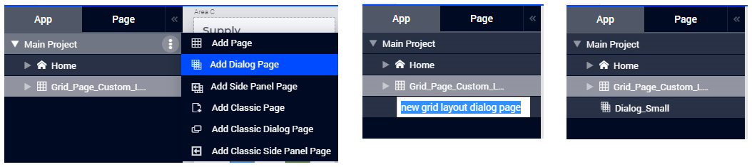
Dialog grid pages can be added at any level in the page tree, just like any other type of page. Unlike pages or grid pages, dialog (grid) pages do not appear in the navigation Menu and can only be accessed via the App/Page Manager, where they have the same options as a page or side panel, like Rename, Delete, etc. You can also move the dialog (grid) pages to a different location within the page tree by using drag-and-drop in the usual way.
Note
Avoid adding pages under dialog (grid) pages as such pages will not be shown in the navigation menu.
By default, a newly added dialog grid page gets the standard grid “Layout 11”, which has just one area for widgets.
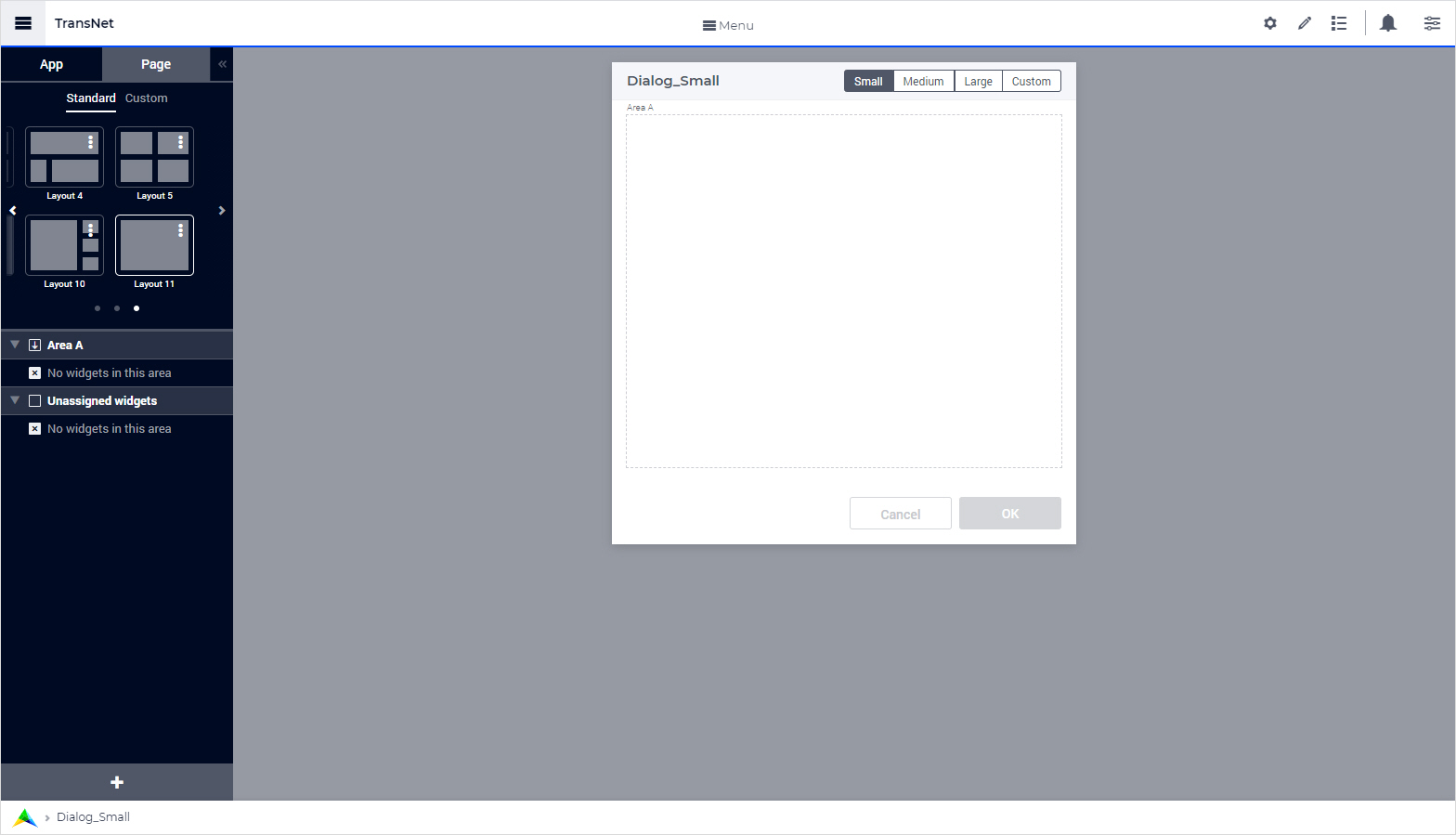
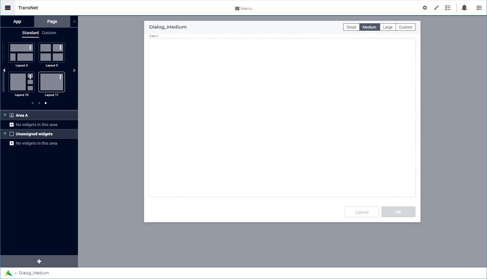
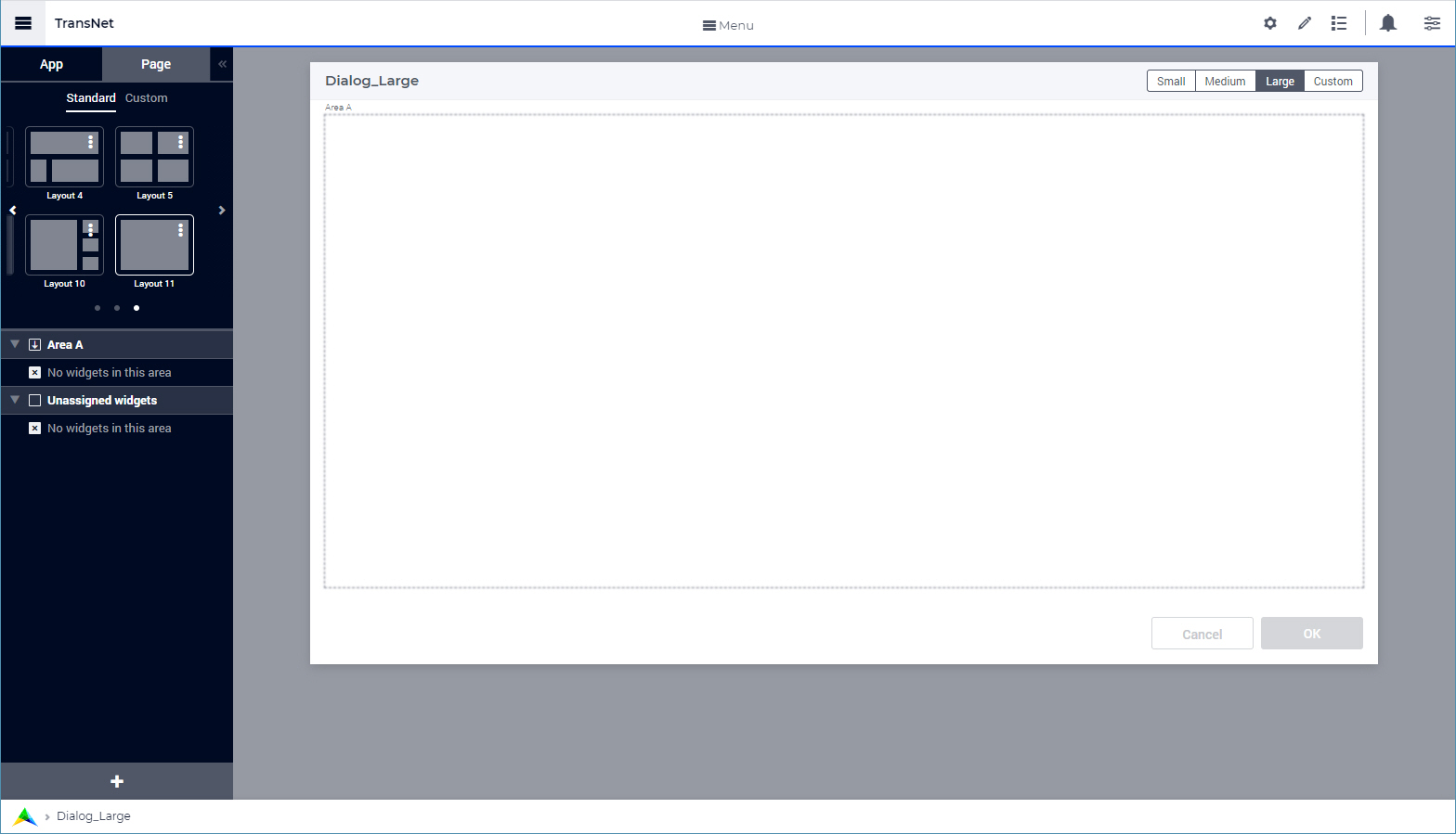
For a dialog grid page you can choose a standard size from the three options Small, Medium and Large, the dimensions of which are as follows:
Small: Width = 3 Columns, Height = 2. This is the default size for a dialog grid page.
Medium: Width = 6 Columns, Height = 3 Rows
Large: Width = 8 Columns, Height = 3 Rows
Besides the option for one of the three predefined sizes above, a dialog grid page has the option for a customized page size. In this case, the height and the width may be specified in the maxrows and the maxcolumns fields of the Miscellaneous section of the Page Settings, which opens automatically when clicking on the Custom size button of the dialog:
Custom Size: Example: Width = 4 Columns, Height = 3 Rows
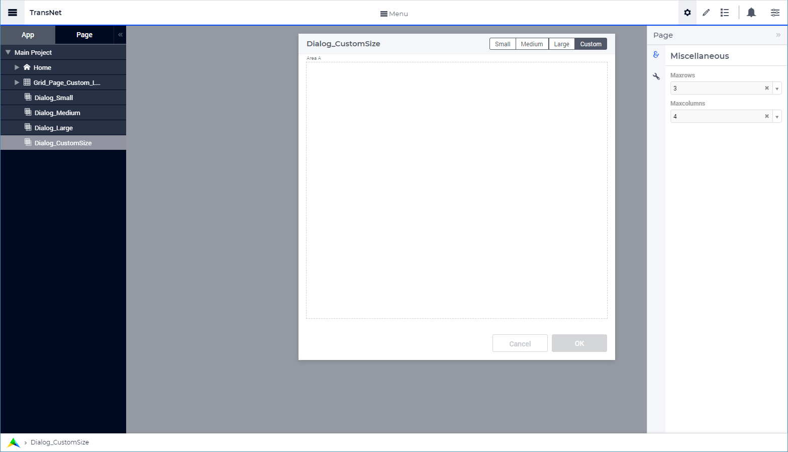
Values must be specified for both the maxrows and the maxcolumns fields in order to define a valid custom page size.
For a dialog grid page with a custom size, the maxrows option can have values between 1 and 4, while the maxcolumns option can have values between 2 and 14. If other values are specified, they will be rounded to the nearest integer within these intervals. For example, a maxcolums value of 1 will be rounded to 2, while a maxrows value of 5 will be rounded to 4.
The pictures above show the dialog grid pages in their preview mode. In this mode, the title and the action buttons shown are just placeholders in order to depict how the actual dialog grid page will look like when displayed. This preview also gives an idea of the usable area for adding widgets in the dialog grid page. In the same way as for regular dialog pages, the title and the action buttons applied on a dialog grid page which is displayed can be configured via the model, see further below.
Adding widgets to a Dialog Grid Page
Essentially, adding widgets to a dialog grid page works in the same way as for a (grid) page, a regular dialog, or a side panel.
First, select a desired dialog size by clicking on the respective button in the top right corner of the dialog grid page or by defining a custom size for it. Subsequently, you can change the current grid layout to another grid layout in the same way as for regular Grid Pages by using the Page Configurator tab of the App Manager. More specifically, the layout may be chosen as any of the available Standard Layouts or Custom Layouts.
Then open the widget manager and add the widgets that you need.
For example, for Dialog_Small declared above, we can keep the Small size and the grid Layout 11 (which has only Area A for widgets) and then add a table widget “demand_table” to this dialog grid page by using the “Add widget” option dialog:
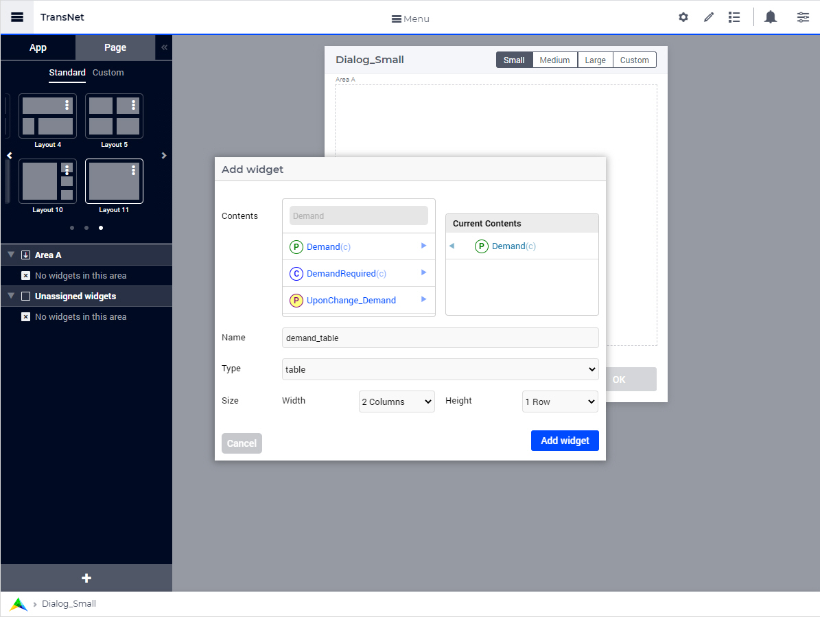
After adding a new widget, it is initially placed in the “Unassigned widgets” section of the grid layout:
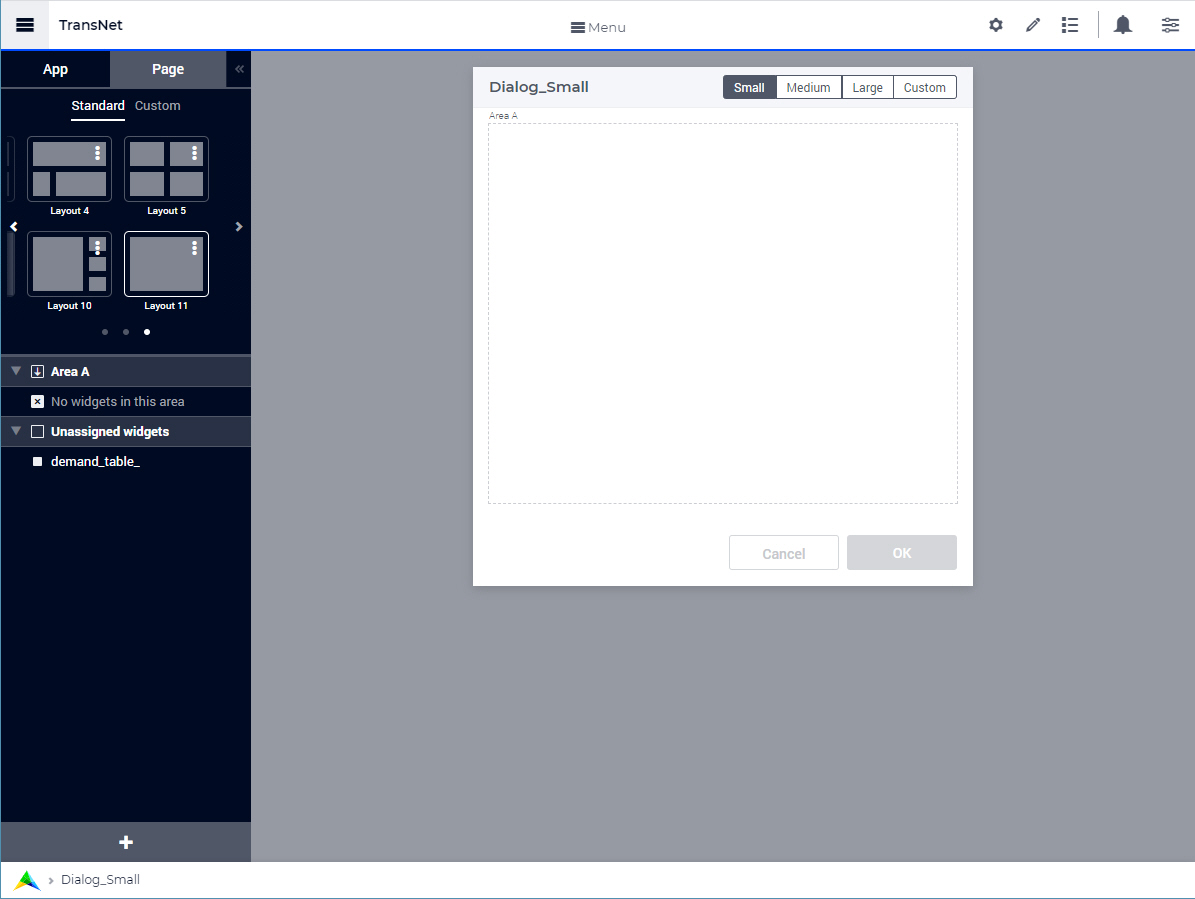
The newly added widget can be moved to one of the grid areas (in this case to Area A) by using drag-and-drop, such that the widget becomes visible on the page:
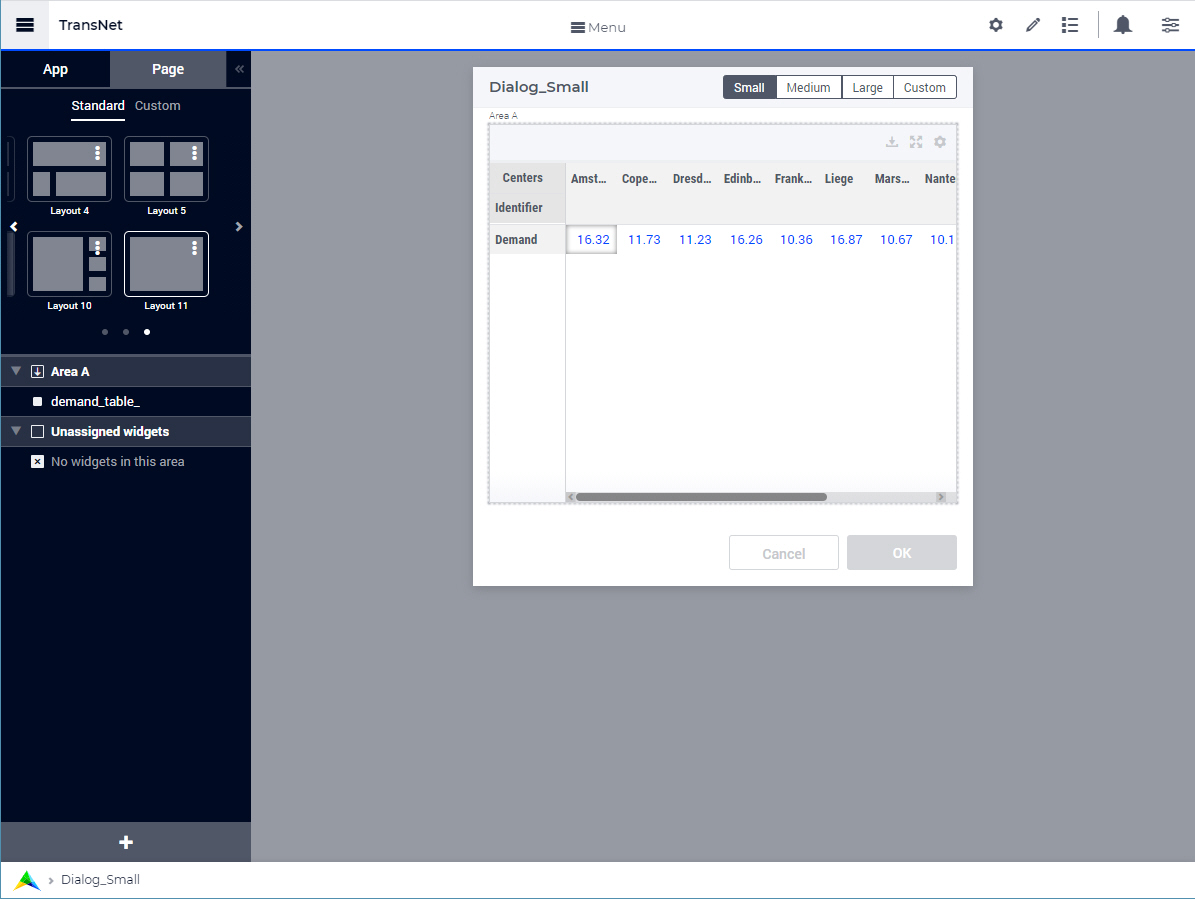
As you can see in the last picture above, when a widget has more data than fits within the width of the assigned grid area, the widget gets a horizontal scroll bar (and similarly, a vertical scroll bar when the height is insufficient).
The dialog grid pages themselves do not offer a scroll bar. Therefore, it is advisable to pick a suitable size and layout for the dialog grid page, depending on the widgets that you want to place on it. You can change the size of the dialog grid page any time in developer mode. However, the sizing options are not available to end users, so the size can no longer be changed after the application has been published.
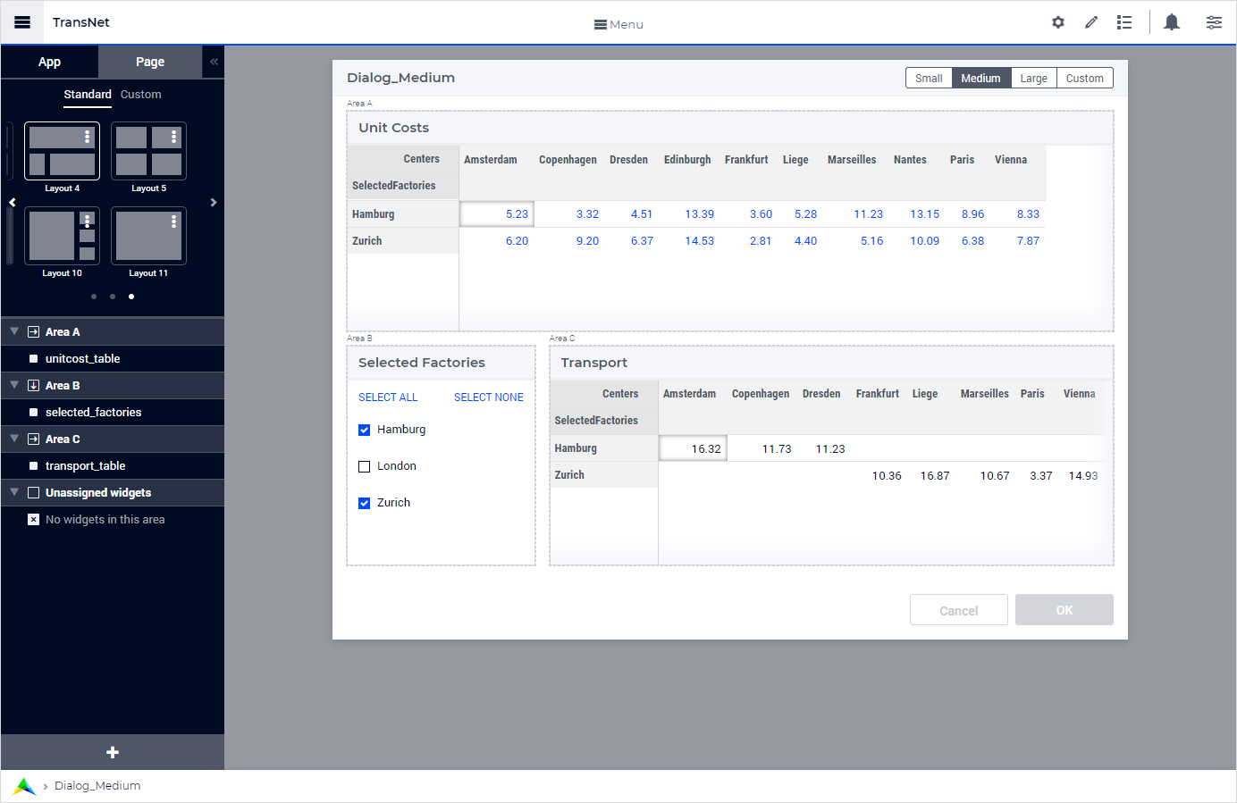
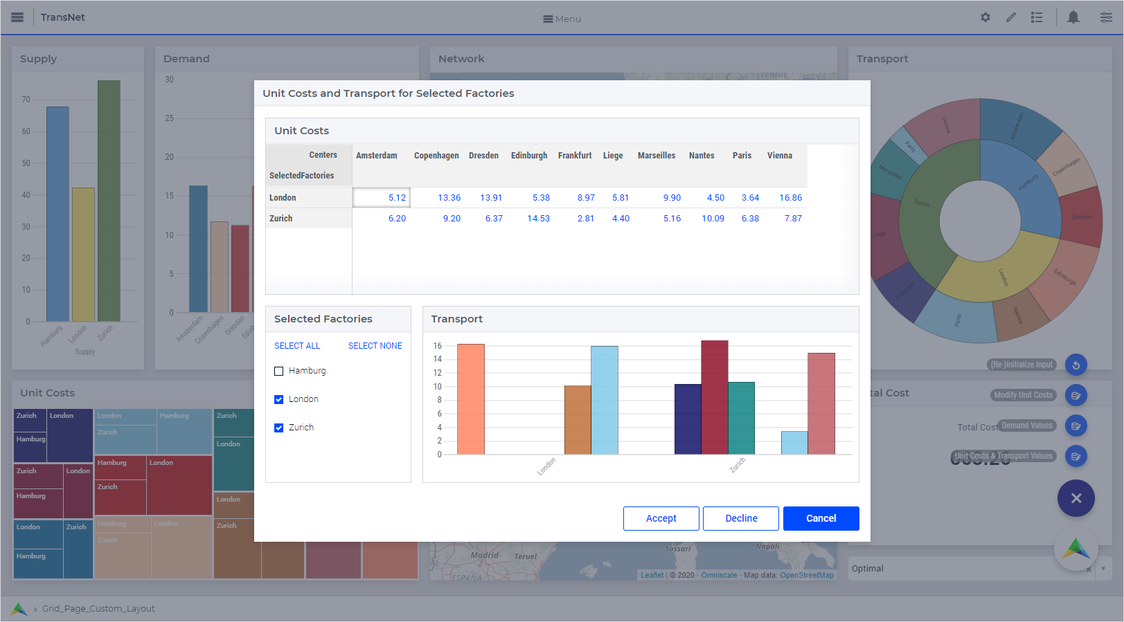
For instance, suppose that on the Dialog_Medium page we would like to show two tables rendering the numerical values of the unit costs and the transportation amounts for a selection of factories. In this case, we can select the standard Layout 4 and add the widgets unitcost_table, selected_factories, and transport_table to Area A, Area B, and Area C, respectively, as illustrated in the following picture:
Once all the required widgets have been added, a dialog grid page is ready to be configured/invoked as explained next.
Configuring Dialog Grid Pages
The procedure OpenDialogPage needs to be used in order to configure/invoke a dialog grid page on the desired page.
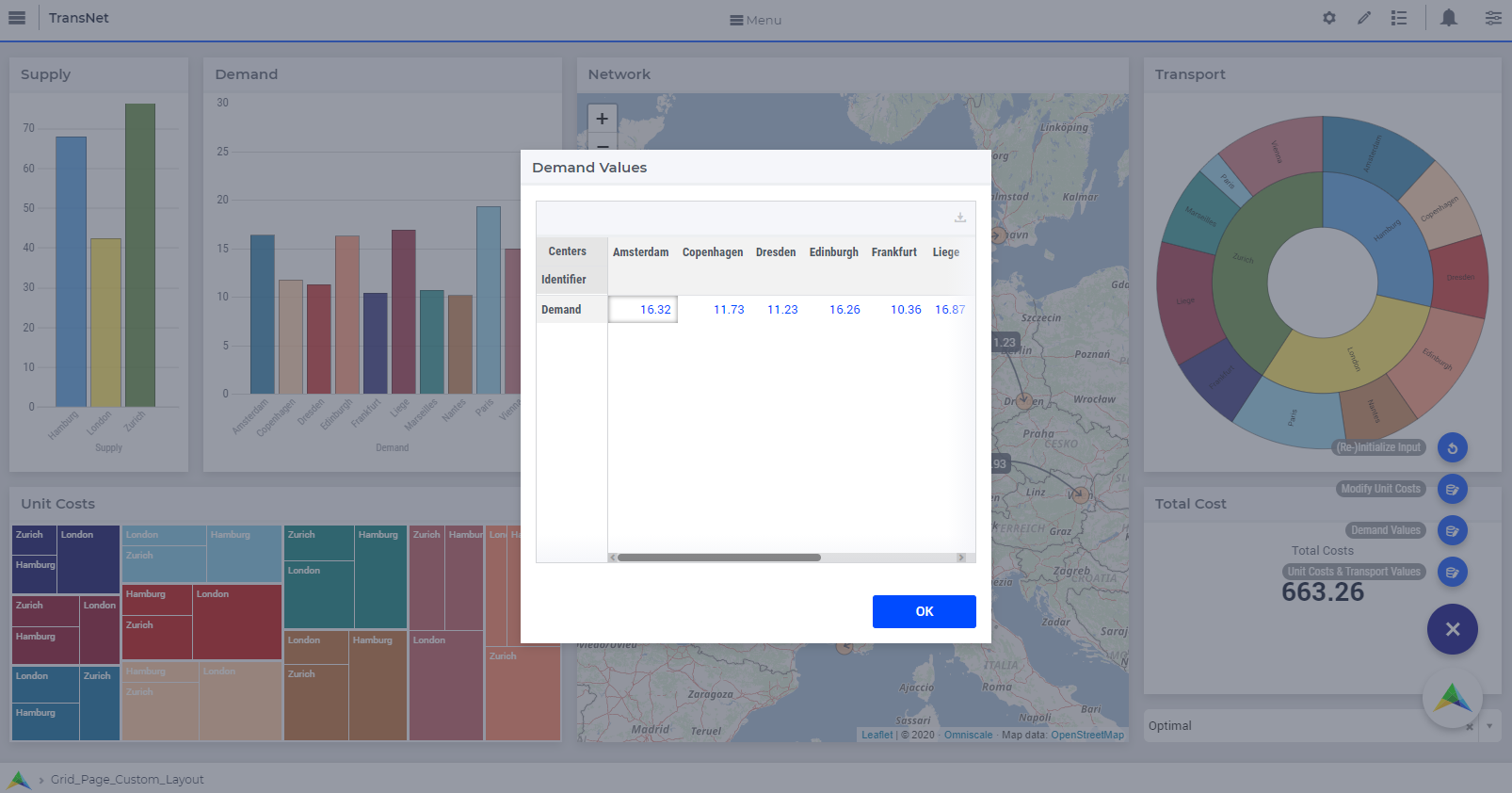
For example, we can define a procedure “Open_Dialog_Small” as
empty DialogActions;

DialogActions := data{ 'OK' };
webui::OpenDialogPage('dialog_small_1', "Demand Values", DialogActions, 'Actions_Procedure');
and use this procedure behind a secondary page action in order to invoke the “Dialog_Small” page with just one action button on it:
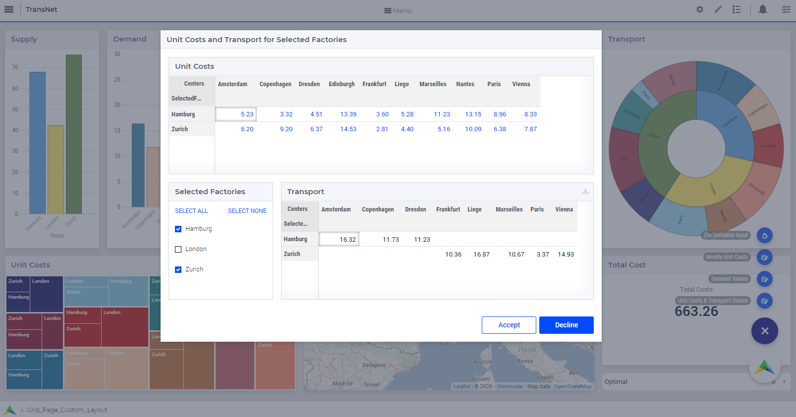
In a similar way, we can define a procedure “Open_Dialog_Medium” as
empty DialogActions;

DialogActions := data{ 'Accept', 'Decline' };
webui::OpenDialogPage('dialog_medium_1', "Unit Costs and Transport for Selected Factories", DialogActions, 'Actions_Procedure');
and use this procedure behind another secondary page action in order to invoke the “Dialog_Medium” page with two action buttons on it:
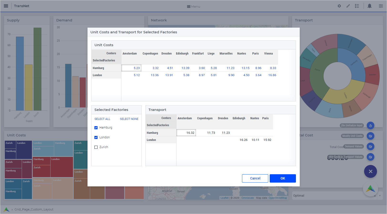
If the specified set of actions is empty, a dialog grid page will show two action buttons “Cancel” and “OK”:
empty DialogActions;

webui::OpenDialogPage('dialog_medium_1', "Unit Costs and Transport for Selected Factories", DialogActions, 'Actions_Procedure');
The button names are assigned from left to right in the order given by the actions set. A maximum of three buttons can be shown on the dialog. If the actions set has more than three elements, only the first three will become visible on the page. In case three buttons are shown on the dialog, the style of the first two buttons are the same (white background) and the third button is different (blue background).
For example, when the invoking code is:
empty DialogActions;

DialogActions := data{ 'Accept', 'Decline', 'Cancel', '4th Action' };
webui::OpenDialogPage('dialog_medium_1', "Unit Costs and Transport for Selected Factories", DialogActions, 'Actions_Procedure');
then the resulting dialog is rendered with three buttons as follows:
As a reminder, the effect of pushing one button or another on a dialog (grid) page is determined by the fourth argument of the procedure OpenDialogPage. This fourth argument is a procedure which itself must have a single input string parameter as an argument. When a user selects an action on the dialog (grid) page, this procedure is invoked with the action name as its argument. So, this procedure may execute different actions depending on the value of its input argument (which is determined by the button pushed by the user).
Interacting With Dialog Grid Pages
When a dialog grid page is open (invoked), the user can only interact with the widgets on the dialog grid page and with the dialog grid page itself. In particular, the user can move/drag the dialog grid page around the page which invoked it. When a dialog grid page is open, no other dialog (grid) page can be invoked from the already opened dialog. The dialog grid page can be closed only by clicking on one of its action buttons.
Note
For a dialog grid page with a custom size, where the maxrows and maxcolumns page options are specified through scalar model parameters, it is possible to put these parameters in a widget placed on the dialog itself and attempt to change the size of the dialog dynamically, after the dialog is invoked. This works fine as long as the dialog is not moved around on the invoking page. However, if the dialog is moved around and then resized dynamically by changing the values of the maxrows or maxcolumns parameters, some unexpected scroll bars could become visible. This situation should be avoided.