Page Settings
You can access the Page Settings via the ‘options wheel’  in the WebUI Menu Bar :
Currently, the following options are available for a page:
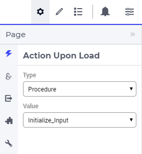
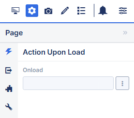
Action Upon Load (for specifying a procedure that should be run upon opening the page)
Action Upon Leave (for specifying a procedure that should be run before navigating to another page). The application developer can also run a procedure that can restrict page navigation based on certain conditions.
Page Extensions for Side Panel Settings (configuring Side Panels described in the Page Manager section) and for Page Action Settings (described further below)
A number of advanced options (not documented here).
Action Upon Load
Note
For a page used as a tab within a Tabbed widget:
The Action Upon Load procedure of the main page is executed first, followed by the procedure of the tab page.
When a tab is selected, the Action Upon Load procedure of the corresponding tab page is executed.
Action Upon Leave
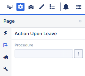
A procedure configured here is automatically called when a user navigates away from a page. The procedure selected has either no arguments or three arguments.
When a procedure with no arguments is selected, it is typically used to releasing resources allocated at opening time, or during interaction with the page.
When a procedure with three arguments is selected, you can also deny the leaving of the page; for instance if the data on the page is incomplete or inconsistent. Further details on the structure and expected behavior of such procedures are provided in the section below.
Note
Restricting Page Navigation
You can implement validation logic within the Action Upon Leave procedure to control whether a user is allowed to navigate away from the current page. This is especially useful for preventing navigation when there are unsaved changes, invalid input, or other conditions that require the user’s attention before leaving the page.
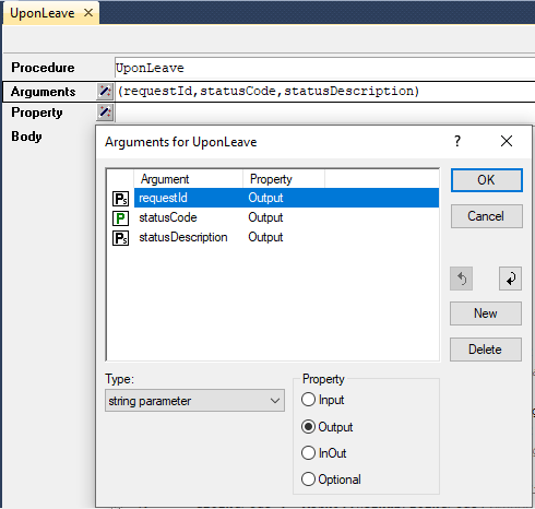
The procedure configured for Action Upon Leave must have three output parameters, in the exact order and naming listed below:
An Output string parameter called
requestIdthat should contain the return value of the parameter RequestCounter.An Output parameter called
statusCoderepresenting the return value of the procedure.An Output string parameter called
statusDescriptionthat should contain a return message for the end-user.
Note
Within the procedure, the requestId and statusCode should be assigned as follows:
requestId := webui::OpenDialogPage or webui::RequestPerformWebUIDialog
statusCode := webui::ReturnStatusCode('OK');
The requestId helps determine whether a Dialog page or Message dialog is open. This allows interaction when the user is not allowed to leave that page.
The pre-defined function webui::ReturnStatusCode has a number of possible arguments (OK, CREATED, BAD_REQUEST, UNAUTHORIZED, CONFLICT and ERROR). Because your procedure is expected to handle the navigation, the status OK is expected if the user is allowed to navigate to the next page successfully. You can use one of the other status codes to signal that the user still needs to stay on the same page. The preferred statuses are OK and ERROR.
The value given for the statusDescription will be displayed in the WebUI when the returned statusCode is any other than “OK”.
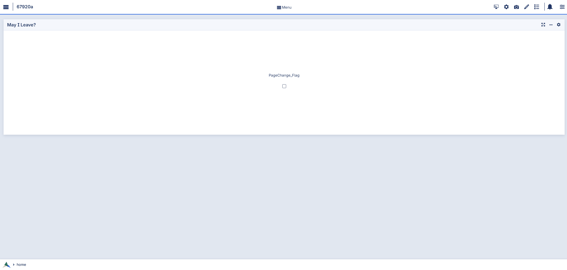
Example
PageChange_Flag, which determines whether the user is permitted to navigate away from the current page.PageChange_Flag is true.Procedure UponLeave {
Arguments: (requestId,statusCode,statusDescription);
StringParameter requestId {
Property: Output;
}
Parameter statusCode {
Property: Output;
}
StringParameter statusDescription {
Property: Output;
}
Body: {
If PageChange_Flag then
statusCode := webui::ReturnStatusCode('OK');
statusDescription := "Good to go";
else
if StopNavigationCheck = 0
then
statusCode := webui::ReturnStatusCode('ERROR');
statusDescription := "Error on page please complete step";
MyActions := data {'OK'};
requestId := webui::RequestPerformWebUIDialog(
"Error on Page",
"There is an error on page and you can't navigate to the next page.",
MyActions,
'Procedure_Actions');
endif;
endif;
StopNavigationCheck := 0;
}
}
OnDone procedure (Procedure_Actions) of the dialog, we set a scalar binary parameter StopNavigationCheck to true to indicate that the user has acknowledged the displayed error message about restricting navigation.Procedure Procedure_Actions {
Arguments: (_action);
StringParameter _action {
Property: Input;
}
Body: {
StopNavigationCheck := 1;
}
}
Demo
As demonstrated in the video above:
When
PageChange_Flagis false, the user is restricted from navigating away and remains on the same page. A message dialog is shown to indicate the reason.When
PageChange_Flagis true, the user is allowed to navigate to the intended page.
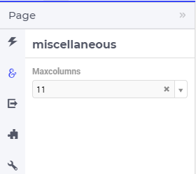
Maximum Number of Columns
You may find that when you change your window size, the widgets re-arrange too often. A simple way to prevent this is to limit the maximum number of columns. You can do this via the ‘page settings’ icon on the app menu bar. At the miscellaneous tab  of the page settings you can edit the
 maxcolumns value (the maximum value that this setting may have is 14 columns):
Page Actions
In the bottom right corner of the page you can find the “Page Actions” menu. It is used for the “Primary Action” and “Secondary Actions”. This feature, together with the Widget Actions, largely replaces buttons on the canvas and frees up space for the widgets themselves. The position of the Page Actions Menu is fixed in the bottom right and floats above all other elements on the page.
Page Actions are independent of a specific widget (typical general actions as optimize, save case, reinitialize, etc.). Widget Actions are focused on data in the widget (recalculate demand, delete selected batch, help on GC, etc.)
The reason behind the Page Actions is to have key actions easily available for the users and to reduce clutter on the pages.
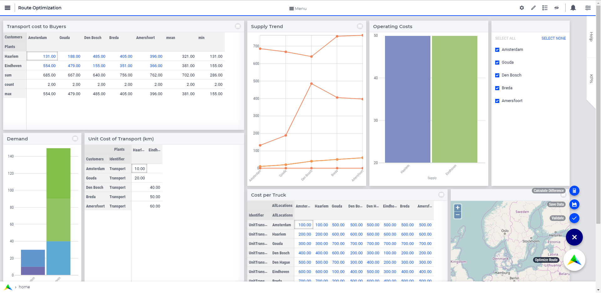
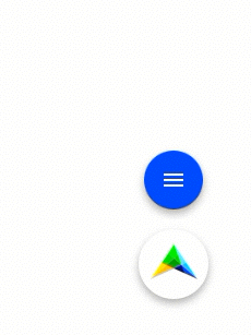
Primary Action
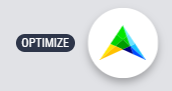
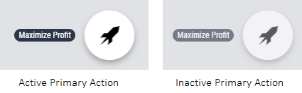
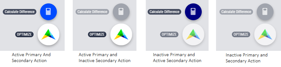
The Primary Action is mainly used for actions that use the power of the AIMMS product. These actions are often called Optimize, Calculate or Solve and do mathematical calculations in some form. It is what separates AIMMS from your standard Business Intelligence application, and therefore features the AIMMS logo by default.
Each page can have only one Primary Action. If there is a need for more than one Primary Action, developers should first consider if this is beneficial to the user: often it is wise to focus on one key task per page. If more than one Primary Action per page is absolutely needed, only one should be considered the most important. Other Primary actions can be placed in Secondary Actions. There is no maximum to the number of Primary Action you can add, but we display the first Active (clickable) action. In case there are no Active actions, we display the first Inactive (not clickable) action as the Primary Action, with the associated style.
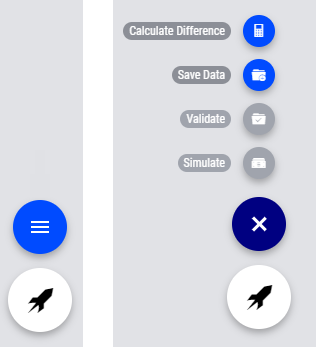
Behavior of the Page Action menu.
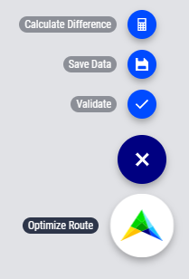
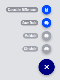
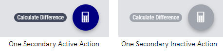
Secondary Action
Besides the Primary Action, the Page Actions consist of “Secondary Action” buttons. These are buttons that serve important functions on the page, for example, “Commit Changes” or “Calculate Difference”.
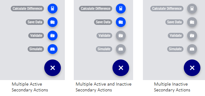
Secondary Action buttons consist of a label and an icon that can be configured in the model. When there are multiple Secondary Actions on a page, they are grouped together in a button with a hamburger icon. This expands to reveal all page actions. There is no maximum to the number of Secondary Actions you can add, but we display the top 10 Active and/or Inactive ordered action buttons on a page. AIMMS advises using ideally no more than five.
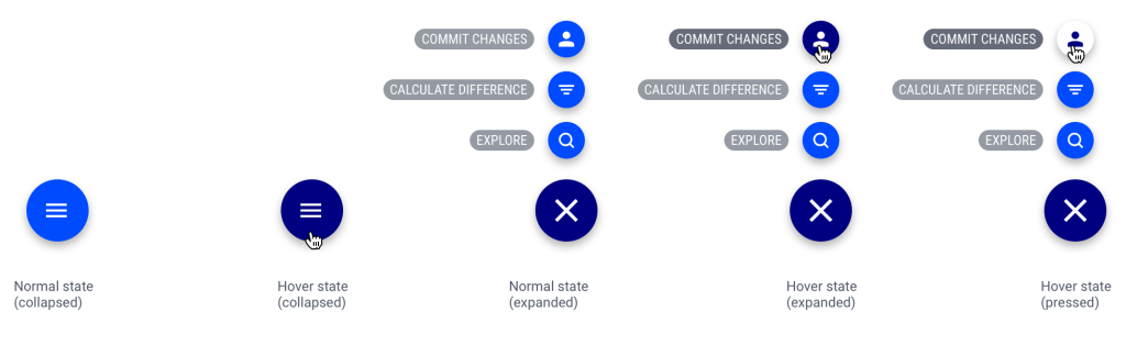
The above image shows the different states of the secondary actions menu.
Configuring Page Actions
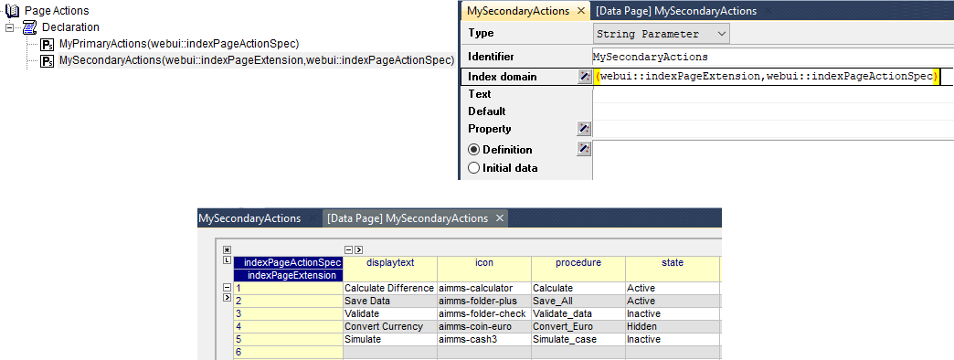
Page Actions can be configured by the application developer via the AIMMS model. In the Public Page and Widget Specification Declarations under the Pages and Dialog Support section, the set PageActionSpecification is declared which is used for configuring Page Actions as illustrated in the next steps.
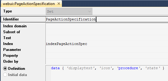
This set has 4 elements representing page action properties:
displayText: The Title/Label to be displayed for the action.icon: The icon you want to associate with the respective action. You can select from a list of 1600+ icons, the reference can be found in the icon list . Custom icons can also be used if required.procedure: The procedure to be called when the action is clicked.state: The display state for the action, i.e. Active (displayed and clickable), Inactive (displayed and not clickable) and Hidden. By default, the state is Hidden.
Configuring the Primary Action
Create a string parameter indexed by webui::PageActionSpecification. Let’s call this MyPrimaryActions(webui::indexPageActionSpec). Right click the string parameter and click on the Data option to open the data page. Add the details for the Primary Action you would like to show for the respective page(s). For example:
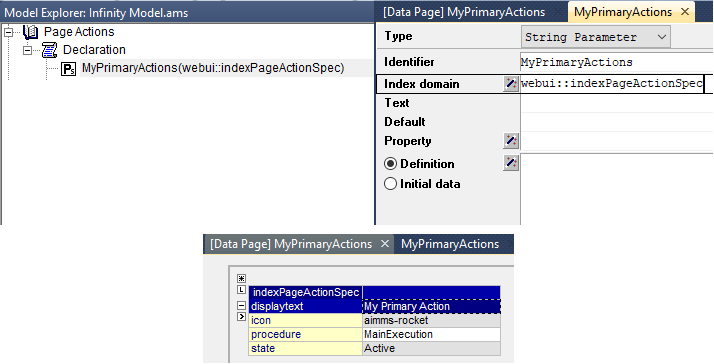
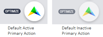
The result of the illustrated example will be

By default, when the displayText is not defined the Primary Action label will be “OPTIMIZE”. When the icon is not defined the AIMMS logo will be displayed.
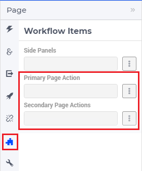
Configuring the Primary Action on Pages
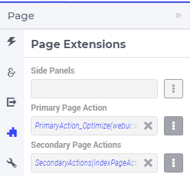
In the WebUI, navigate to the respective page. In the Page Settings under the Page Extensions  you will find the Primary Action and Secondary Actions fields. Add the respective string parameters in the fields that were configured for that page.
Once you have added the string parameter, the primary action will appear on that page.
Similarly, you can create other string parameters for other pages and configure them using the same steps.
Configuring Secondary Actions
Create a string parameter indexed by the webui::ExtensionOrder set with webui::indexPageExtension and webui::PageActionSpecification with the index webui::indexPageActionSpec. Let’s call this MySecondaryActions(webui::indexPageExtension,webui::indexPageActionSpec). Right click the string parameter and click on the Data option to open the data page. Add the details for the Secondary Actions you would like to show for the respective page(s). For example:
Note
When creating the string parameter to configure secondary page actions, the first index needs to be in a subset of integers. You can create your subset of integers and use the respective index as well. To make it convenient you can use the index from the pre-declared set webui::ExtensionOrder for this purpose i.e. webui::indexPageExtension.
In the illustrated example, we have defined 5 Secondary Actions with different states. We display the Active and Inactive actions.
Configuring Secondary Actions on Pages
documentation/_build/html/library.html
In the WebUI, navigate to the respective page. In the Page Settings under the Page Extensions tab  you will find the Primary Page Action and Secondary Page Actions fields. Add the respective string parameters in the fields that were configured for that page.
Once you have added the string parameter, the respective page actions buttons will appear on that page.
Similarly, you can create other string parameters for other pages and configure them using the same steps.
Possible combinations of action states
The different combinations and possibilities with the states are illustrated below:
Default Primary Action
One Primary Action
One Secondary Action
Multiple Secondary Actions
Primary Action with one Secondary Action
Primary Action with multiple Secondary Actions
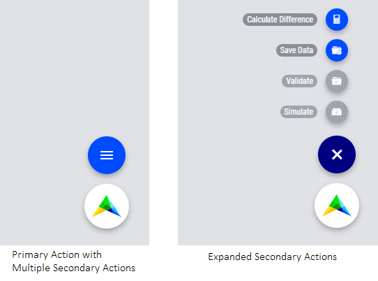
The labels for the Primary Action and single Secondary Action are shown when the user hovers the respective buttons.