Button Widget
The Button widget allows the user to execute an action upon clicking it. The type of action executed is determined by the widget settings:
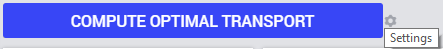
Below we will discuss and illustrate the types of actions which may be specified through the Settings wheel as shown in the picture above.
Note
Please note that calling the pre-defined function ExitAimms from within WebUI (for example, as part of an action behind a button) is currently not supported and will result in an error (for more info on this function, please see AIMMS Function Reference).
In fact, calling ExitAimms only works for the main AIMMS thread itself and not for any of the other AIMMS contexts (of which WebUI is just one example). Exiting only from the underlying AIMMS session itself is not deemed to be proper behavior for an application with a WebUI. See also: “Constructs to Avoid” section in the AIMMS PRO documentation.
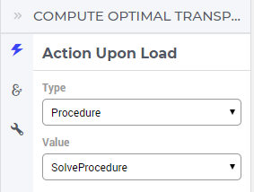
Action
For example, in the TransNet application, if the action type is set to Procedure, you can select one of the procedures in the model, e.g. SolveProcedure, as the action to be executed:
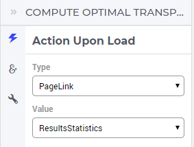
If the action type is set to PageLink, you can select one of the other pages in the app’s WebUI to link and open upon click (ResultsStatistics is a potential other page here):
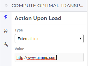
Finally, if the action type chosen is ExternalLink, you can select a URL for an external web page (i.e. a page not in your WebUI, but from anywhere on the internet) to open:
Miscellaneous
In the Miscellaneous tab of the button’s options editor, other options may be set that are explained below:
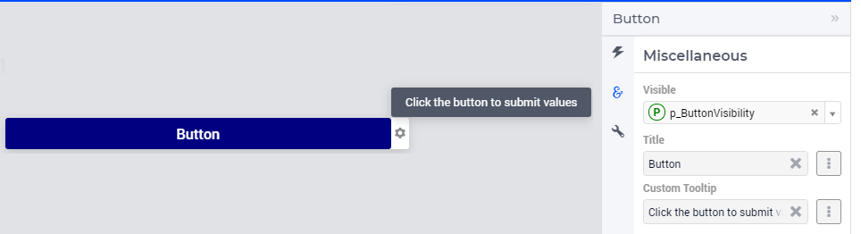
Visibility
You can control the visibility of the button by either specifying a literal value 1 (visible) or 0 (hidden) or a binary parameter.
Title
Set the button title/text here. You can specify either a literal value like “OK” or “Accept” (without the quotes) or a string parameter.
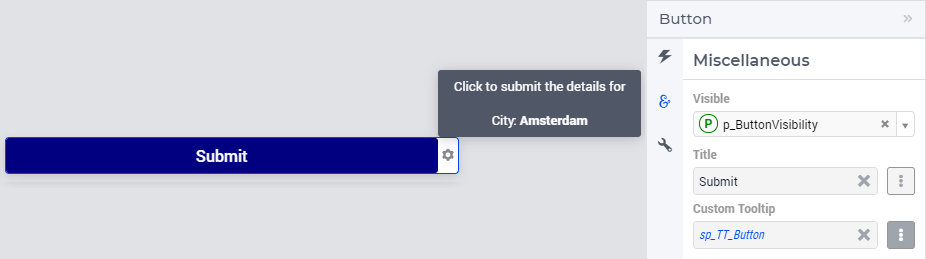
Custom Tooltip
You can specify a custom tooltip to display more information when the user hovers over the button. You can specify either a literal value like “Click here to confirm the action” (without the quotes) or a string parameter.
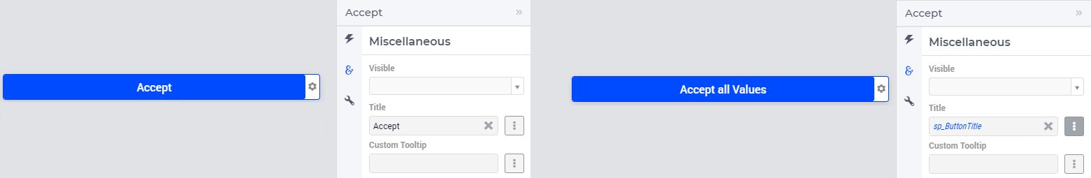
The content for the string parameter can be data driven. It can also contain HTML.
As illustrated below, the definition of string parameter sp_TT_Button is used to specify the Custom Tooltip option.
formatstring("Click to submit the details for <br><br>City: <strong>Amsterdam</strong>");