CSS Styling
As mentioned before, it is possible to (re)style your web application by providing custom Cascading Style Sheets (CSS). This section discusses this topic in more detail.
Data-Dependent Styling
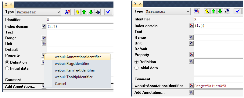
You can define user-annotations in your AIMMS model which will be used to style the corresponding so-called DOM elements in the WebUI page. In order to define user annotations for an identifier X(i,j) that is being displayed in a widget, you can define a string parameter, say DangerValuesOfX(i,j), defined over a valid subdomain of the original identifier. This string parameter should have as value a space-separated string of class-names (that will be used to decorate the DOM elements with). In the attribute form of the identifier for which you are specifying the annotations, you should add the webui::AnnotationsIdentifier annotation attribute and then fill in the string parameter containing the desired annotation(s) there:
In combination with an additional project-specific CSS file, you can then specify the styling on, for example, a per-table-cell basis.
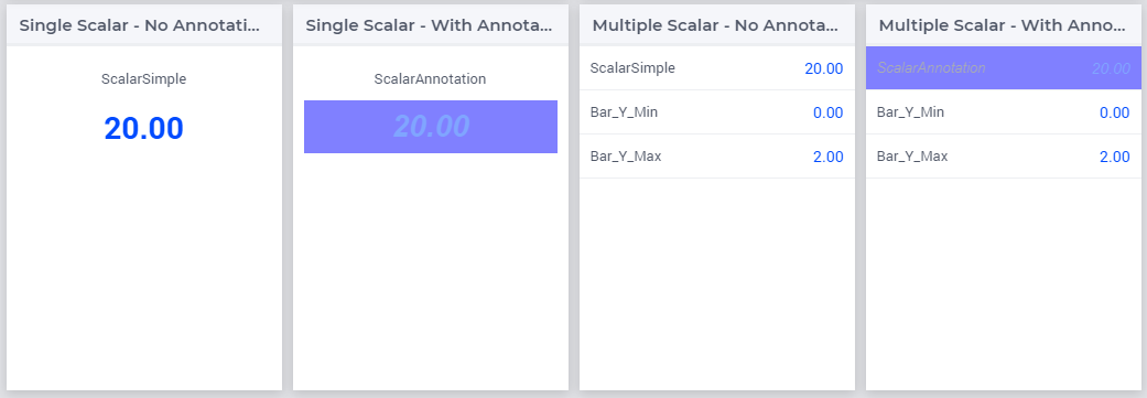
For example, the following ‘user annotation’
StringParameter DangerValuesOfX {
    IndexDomain: (i,j);
    Definition: "invalid-value danger" onlyif ( Y(i,j)  >= Y_UB(i,j) );
}
In combination with the following CSS rule
.aimms-widget td.annotation-invalid-value {
    background-color : red;
}
will show all cells in tables (because of the .td class), where the annotation has the value invalid-value with a red background color. Note that the DangerValuesOfX shows a combination of two annotations: invalid-value as well as danger, but only the former is used in the example above.
By default, all core WebUI plugins (including widgets) will prefix user annotations with annotation- and replace white space characters, like spaces or tabs, with a hyphen (-). It is recommended that app developers use this as well. For more information: see AWF.Util.getAsCSSClasses.
Note
Please note that in AIMMS versions prior to 4.49, you had to define a string parameter called
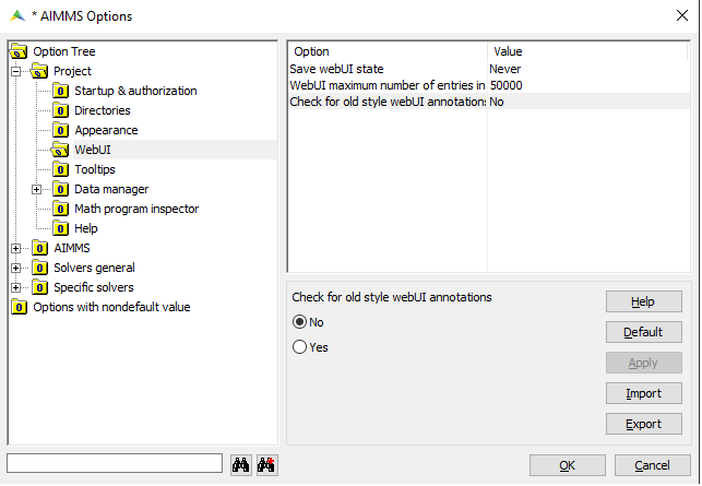
X_annotations(i,j)(with the domain of this ‘_annotations identifier’ being a valid subdomain of the original identifier) in order to achieve the same result. This had the disadvantage that when you renamed the original identifier, the ‘_annotations identifier’ was not automatically renamed with it, possibly leading to unexpected effects in the WebUI front-end.AIMMS displays warning messages during startup when it encounters identifiers with the old-style WebUI annotations. This helps you update your model and adjust to the new way of applying annotations.

In case you do not want AIMMS to display these warnings, you can toggle the option Check for old style webUIannotations to No in the Project Settings as shown below.
The WebUI uses flags to indicate whether a certain DOM element corresponds to a readOnly value or not. DOM elements that correspond to editable values are annotated with a flag-editable CSS class while read-only DOM elements are annotated with a flag-readOnly class. It is possible to make the data which is editable from a model perspective appear as read-only in the WebUI by using user-flags. One can achieve this as follows: define a new string parameter in the model, say FlagsOfX(i,j), add a webui::FlagsIdentifier annotation to the attribute form of the original identifier X, and fill in the new string FlagsOfX(i,j) as the contents of this annotation:
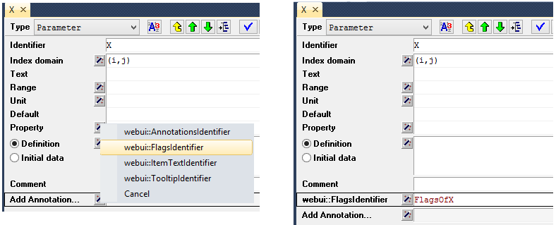
Finally, one can assign the value readOnly to FlagsOfX(i,j) for the (updatable in the model) values of X(i,j) which should appear as read-only in the front-end.
Note
Please note that in AIMMS versions prior to 4.71, you had to define a string parameter called X_flags(i,j) (with the domain of this ‘_flags identifier’ being a valid subdomain of the original identifier) in order to achieve the same result. This had the disadvantage that when you renamed the original identifier, the ‘_flags identifier’ was not automatically renamed along with it, possibly leading to unexpected effects in the WebUI front-end.
Widgets and CSS properties supported for annotations
There are several CSS properties that can be changed for each widget that support annotations. AIMMS provides support for specific CSS properties with respect to CSS customization. The below table denotes the supported widgets and their respective CSS properties that can be changed.
Widgets |
CSS Property |
|
|---|---|---|
Bar Chart |
fill, fill-opacity |
stroke, stroke-width, stroke-dasharray |
Line Chart |
fill, fill-opacity |
stroke, stroke-width, stroke-dasharray |
Pie Chart |
fill, fill-opacity |
stroke, stroke-width, stroke-dasharray |
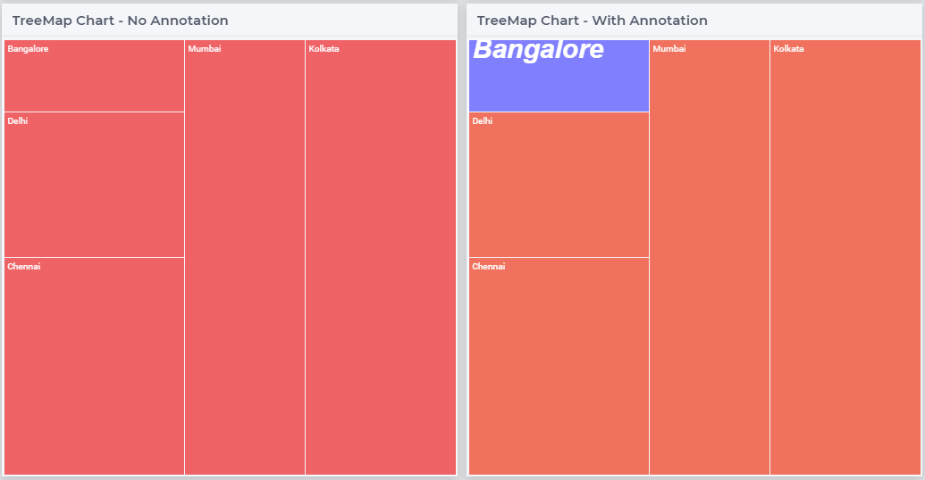
TreeMap Chart |
background, opacity |
font-size, font-family, font-style, font-weight |
Gantt Chart |
fill, fill-opacity |
stroke, stroke-width, stroke-dasharray |
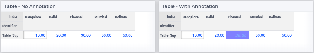
Table |
background, opacity |
font-size, font-family, font-style, font-weight |
Bubble Chart |
fill, fill-opacity |
stroke, stroke-width, stroke-dasharray |
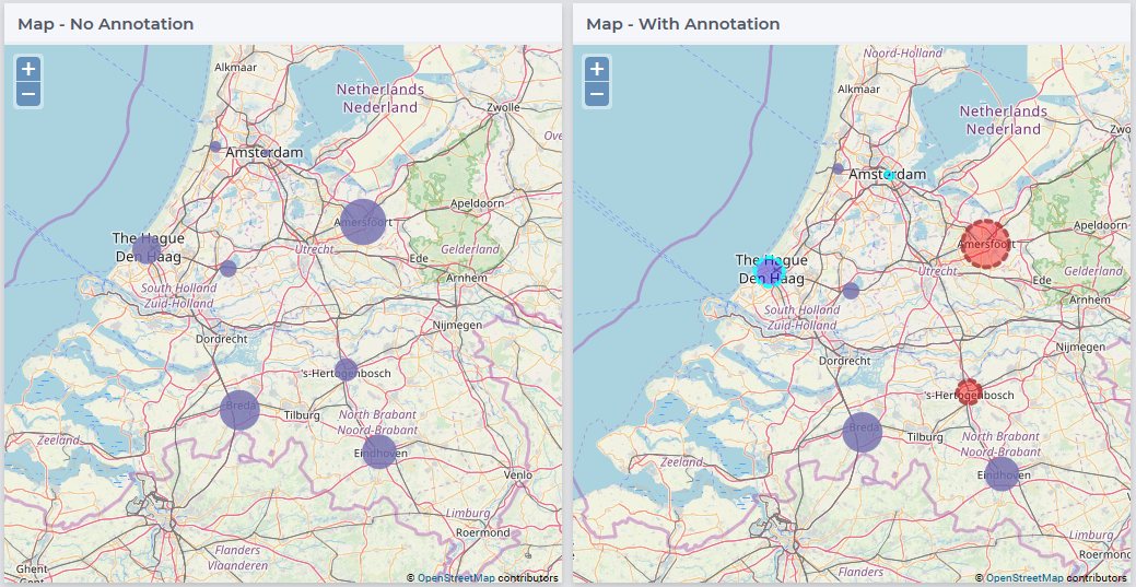
Map (Nodes) |
fill, fill-opacity |
stroke, stroke-width, stroke-dasharray |
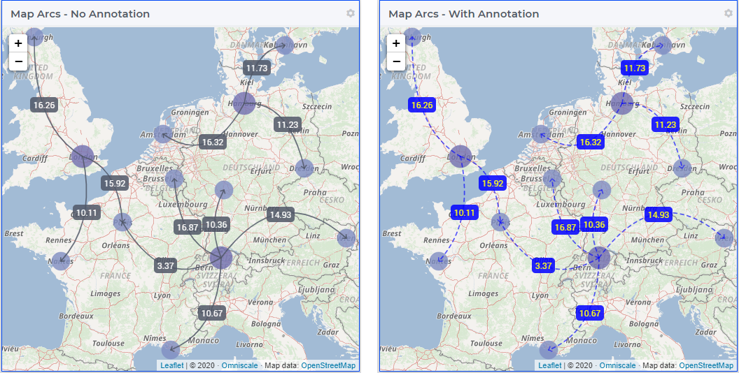
Map (Arcs) |
background, color, opacity |
stroke, stroke-dasharray, stroke-opacity |
Scalar |
background, opacity, border |
font-size, font-family, font-style, font-weight |
Warning
For Line Chart, Bubble Chart and Map the radius property “r” is supported only on the Chrome browser, and not on IE 11 and Edge browsers.
The Bar Chart, Line Chart, Pie Chart, Gantt Chart, Bubble Chart and Map widget use SVG elements. SVG stands for Scalable Vector Graphics, and uses a coordinates system to draw different vectors, like the rectangles and circles in charts. AIMMS supports the use of the fill and stroke properties for SVG elements.
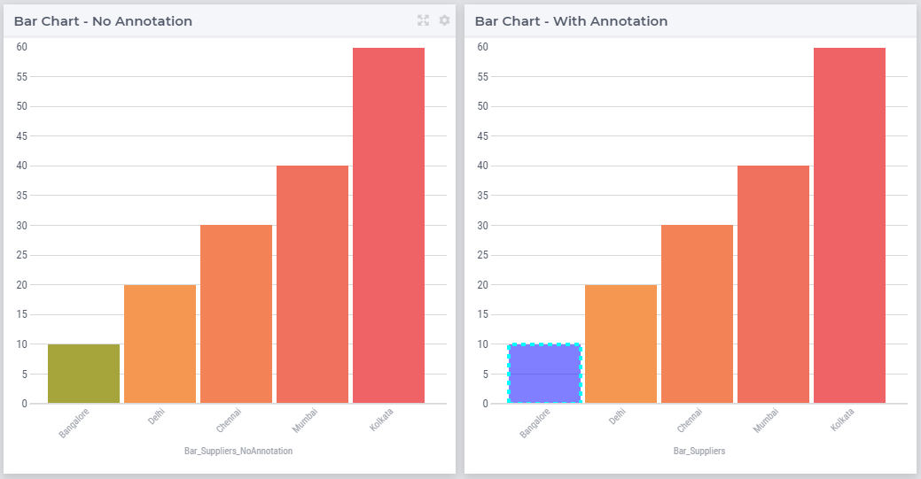
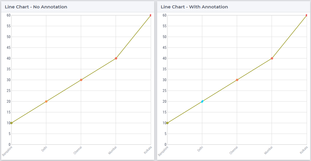
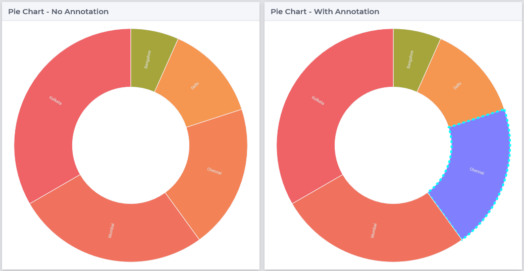
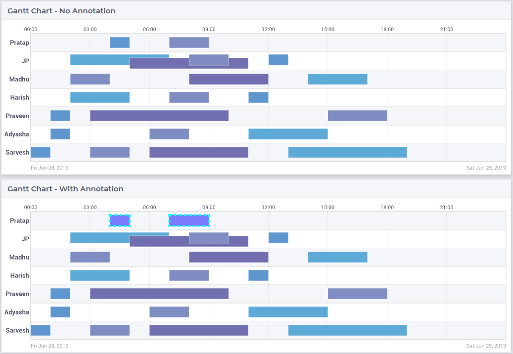
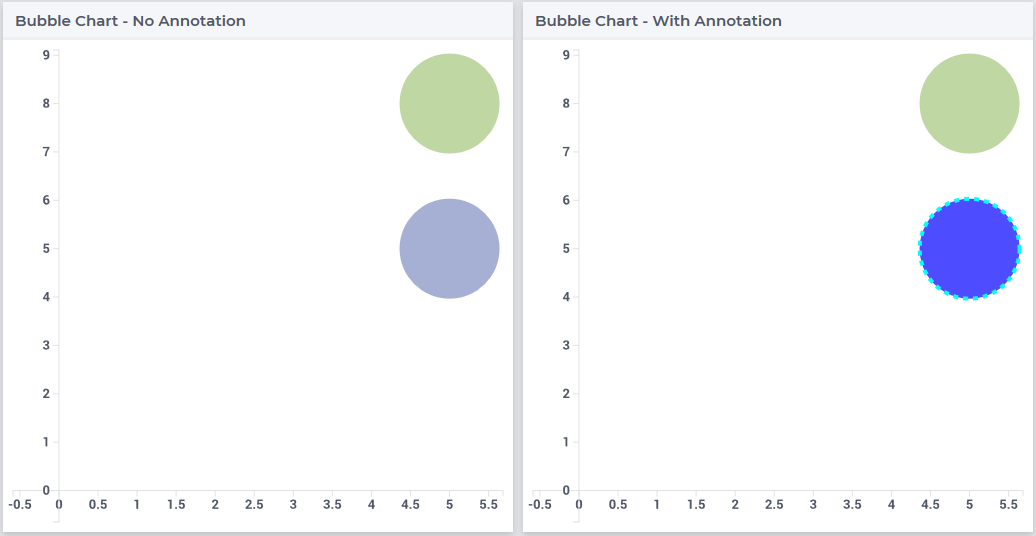
The illustration below shows the use of SVG properties to change the fill and stroke of a bar chart when the annotation “blue” is added to the identifier. Followed by illustrations of the other charts.
.annotation-blue{
/* fill changes */
    fill: blue;
    fill-opacity: .5;
/* stroke changes */
    stroke: aqua !important;
    stroke-width: 4 !important;
    stroke-dasharray: 5;
}
For arcs on the map widget the CSS properties vary slightly as illustrated below:
.annotation-blue{
/* Arc line */
    stroke: blue !important;
    stroke-dasharray: 5px;
    stroke-opacity: .8;
/* Arc label and text color */
    background: blue !important;
    color: yellow !important;
    opacity: .8 ;
}
The Table, Treemap Chart and Scalar widget use the DIV element. A DIV defines a division or a section in an HTML document. The <div> element is often used as a container for other HTML elements to style them with CSS or to perform certain tasks with JavaScript. AIMMS supports the use of background and font properties.
The illustration below shows the use of DIV properties to change the background and font of a table cell when the annotation “blue” is added to the identifier, followed by illustrations of the TreeMap and Scalar widgets.
.annotation-blue{
/* fill changes */
    background: blue;
    opacity: .5;
/* text changes */
    font-size: 30px !important;
    font-family: sans-serif;
    font-style: italic;
    font-weight: bold;
}
Tip
There are hover and select effects on the charts and Map widgets which can be changed, but are not yet supported by AIMMS. If you would like to change the properties of those states as well, please look at our How To document on changing CSS effects on charts.
Highlighting (experimental)
Important
Highlighting is available in software versions from AIMMS 4.68.5 onwards as part of Experimental Features. Please visit the Experimental Features page on how to enable the feature.
Next to the annotations mechanism described above, we offer a lightweight way to responsively highlight certain tuples in the Table and the Gantt Chart widget. As opposed to the former, this feature removes the need to re-render the whole widget just for highlighting a specific (small) selection of tuples, making it more responsive. To use it, you have to provide an additional string parameter in your model, which has the exact same index domain as the identifier(s) displayed in the widget, extended with an extra index indexIdentifiers. You need to specify this identifier in the Highlight option provided in the Miscellaneous tab of the widget’s options editor. For example, if you display an identifier JobDuration(i, j) in a Gantt Chart, you need to introduce a string parameter like GanttHighlight(i, j, indexIdentifiers). You can choose any identifier name which suits your model.
In your model, you can determine which tuples you want to highlight in your widget, by assigning values to the additional string parameter. For example, you could write something like:
if JobDuration(i, j) > max_duration then
        GanttHighlight(Selected_i, Selected_j, 'JobDuration') := "exceeds-time-limit";
endif;
This would result in an annotation annotation-exceeds-time-limit on the Gantt Chart’s bar representing the (i, j) tuple. In css, you could then add a rule like:
.annotation-exceeds-time-limit {
        fill: red;
}
to color the bar red.
You are of course not restricted to highlight just a single bar. You could also write something like:
if JobDuration(i, j) > max_duration then
        GanttHighlight(Selected_i, j, 'JobDuration') := "exceeds-time-limit";
endif;
In combination with the css rule above, this would result in all jobs for the Selected_i to be colored red. However, keep in mind that this mechanism is intended for use with a relatively low number of tuples. If you want to style a huge number of tuples, we recommend using the annotations method described above.
If you display more than one identifier in a widget, you can specify the tuples for those by using the corresponding identifier name(s) in the extra index.
Annotations or Flags in Custom Plugins
Applying annotations or flags
Core plugins (widgets, addons, etc.) now prefix all model annotations and flags with e.g. annotation- or flag- when these are used in HTML element attributes. Additionally, to ensure valid values, all sequences of white space are converted into single hyphens: for example, the annotation some model info becomes annotation-some-model-info.
Core styling has also been updated to adopt this pattern.
To properly prefix annotations or flags, use the AWF.Util.getAsCSSClasses utility-method:
// More usually, these would be requested from the datasource's
// annotations and flags layers.
const annotations = ["foo", "bar baz"];
const flags = ["readOnly"];

// Generate an array of prefixed, escaped versions of the original
// model annotations.
const annotationsAsClasses = AWF.Util.getAsCSSClasses(annotations);

// The default prefix is "annotation" plus a hyphen, but the second
// argument allows alternative prefixes.
const flagsAsClasses = AWF.Util.getAsCSSClasses(flags, "flag");

// somePluginElQ would be defined elsewhere, and is a jQuery element.
// This concatenates the prefixed flags and annotations arrays, joins the
// array items with spaces, then adds them as classes to somePluginElQ.
somePluginElQ.addClass(annotationsAsClasses.concat(flagsAsClasses).join(" "));
This will result in an element with the following class attribute:
... class="annotation-foo annotation-bar-baz flag-readOnly" ...
Manipulating and selecting elements by annotations or flags
Once an annotation or flag has been applied to an HTML element in a plugin, that element can be selected programmatically, or styled, with CSS selectors.
To achieve this, the prefixed annotation or flag should always be CSS-escaped using the standards-track CSS.escape method. A substitute for this method is provided by the WebUI runtime when the user’s browser does not yet support it.
Example 1: Programmatically selecting and manipulating HTML elements by annotation or flag
Example JavaScript:
// This selects all widgets with the class "annotation-bar-baz", and adds the
// class "my-widget" to them.
$(".aimms-widget." + CSS.escape(annotationsAsClasses[1]))
    .addClass("my-widget")
;
Example 2: Using the annotation or flag in a style sheet
The prefixed annotation or flag should still be properly escaped for use in a selector, although in these examples it is not strictly necessary. Example CSS:
/* This styles all text in widgets with the classes "my-widget" and "flag-readOnly" in gray. */
.my-widget.flag-readOnly {
    color: #808080;
}
Custom Icon Sets
Certain features like the Widget Actions or the (experimental) Page Actions may use icons. AIMMS has a predefined list of 1600+ icons which can be used. Custom icons can also be used for the aforementioned features by adding the desired icon font to the CSS folder and using the class names defined in the .css file in the icon field in the model specification. The icon font folder will need to have at least the .ttf file or the .woff file and the corresponding .css file, which together define the icon.
When an icon font is downloaded it will have the CSS file with the TTF and/or WOFF files. Just add these to the Resources/CSS folder. To use the icons, open the CSS file and use the class name for the respective icon in the icon file in the model specification.
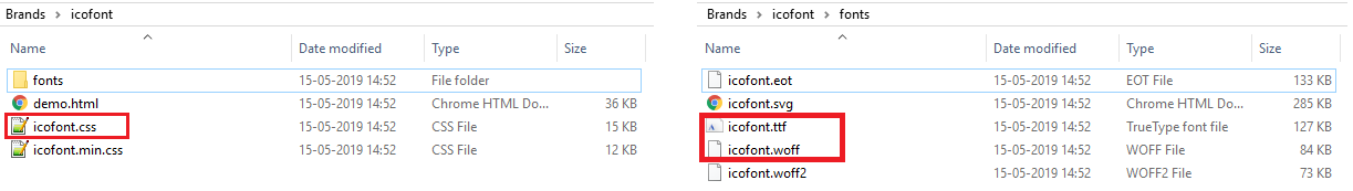
For example, the icofont.css may have classes defined for each icon as illustrated below:
.icofont-brand-acer:before
{
    content: "\e896";
}

.icofont-brand-adidas:before
{
    content: "\e897";
}

.icofont-brand-adobe:before
{
    content: "\e898";
}
You need to pick the name of the desired icon class and assign it to the icon field in the model specification. e.g., icofont-brand-adidas