Diagram Widget
Important
Creating a Diagram Widget
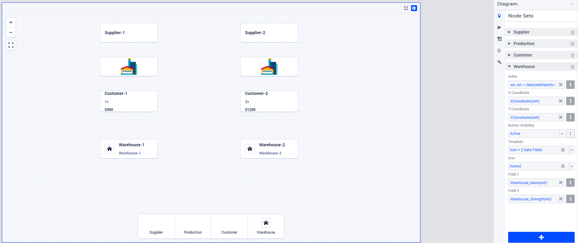
A Diagram widget can be added to a page using the same steps as for any other widget, as outlined in the adding a new widget section. After adding the Diagram widget type, you can access its Settings by clicking on the Settings wheel icon to bring up its options editor, as displayed in the image below.

In the options editor, you will find the following sections:
 Node Sets: Multiple node sets can be added here.
 Arc Set: Just a single arc set can be added here.
 Widget Extensions: Configure Widget actions and Item actions here.
 Miscellaneous: Control the Title, Zoom, Center X, Center Y and Visibility options here.
 Advanced: Advanced options for this widget are available here.
Adding Node Sets
Navigate to the “Node Sets” section. Click on the “+” sign button located at the bottom. This action will allow you to add details for the Node Set Options:
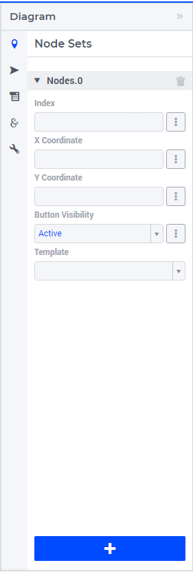
The available options to be specified are the following:
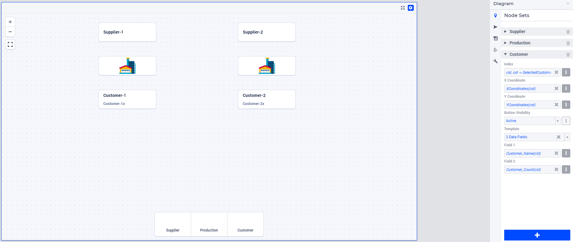
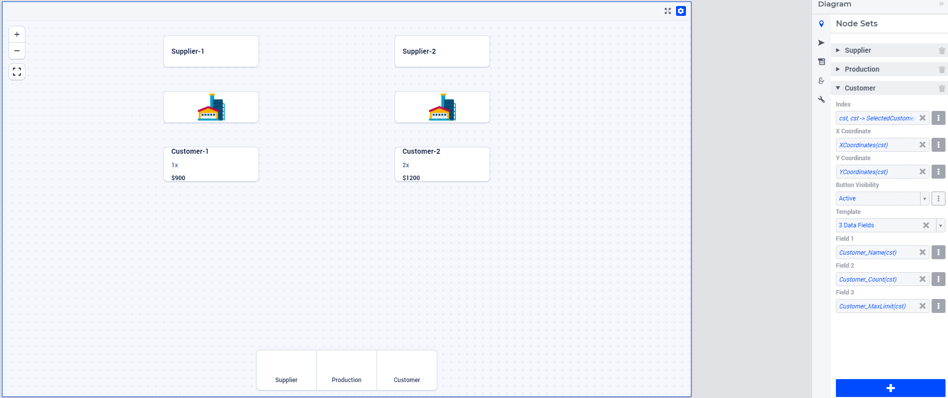
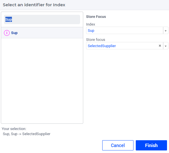
Index: Select the index of the node set to be displayed. While configuring this Index, you can set the Store Focus element parameter info.
X Coordinate: A 1-dimensional parameter specifying the X-coordinates for the nodes within this selected index.
Y Coordinate: A 1-dimensional parameter specifying the Y-coordinates for the nodes within this selected index.
Tooltip: This is an optional field. If left unspecified, no tooltip is shown when hovering over a node, as the relevant information is already displayed within the node itself. When provided, it accepts a 1-dimensional string parameter containing tooltip text for the corresponding nodes. Hovering over a node then displays its associated tooltip.
Note
<script> tags or image tags containing onerror or javascript attributes will be removed before rendering. This ensures that arbitrary JavaScript code cannot be executed within the application, mitigating potential security risks.Button Visibility: An option either controlled through a scalar string parameter or by selecting one of the three available values, to control the visibility of the “Add Node” button on the canvas of this node set. If the value of this option is “Active”, the respective Node button is visible on the lower-middle of the canvas. If it is “Inactive”, the respective Node button is visible but is inactive, greyed out. If it is “Hidden” or any other value, then this Node button is not visible at all on the canvas.
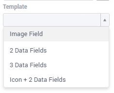
Template: This is an optional field. If left unspecified, the respective nodes will be shown with a default UI. This option offers four template options, each affecting how nodes are presented on the canvas:
Please note that the X- and the Y-coordinates are registered in the model when you put nodes on the diagram, or move them. This works in both directions: changing the value of these parameters from within the model will affect the actual positions of the nodes.
Templates for Nodes


Tip
Important
if (pro::ModelName = "undefined")
then  ! Developer mode
    "/app-resources/resources/images/MyImage.jpg"
else  ! PRO - end user mode
    formatString("/app-resources/%s/%s/resources/images/MyImage.jpg", pro::ModelName, pro::ModelVersion)
endif;
Annotations for Nodes
webui::AnnotationsIdentifier annotation attribute to the Set that the nodes are indexed over. For more details on supported CSS properties, please refer to the CSS properties supported for annotations section.Store Focus, Hover and Select for Nodes
Adding an Arc Set
After selecting the “Arc Set” section in the options editor, you can add options for an Arc set:
The available options to be specified are as follows:
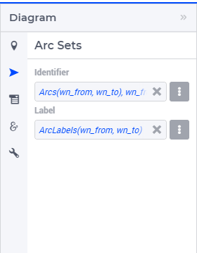
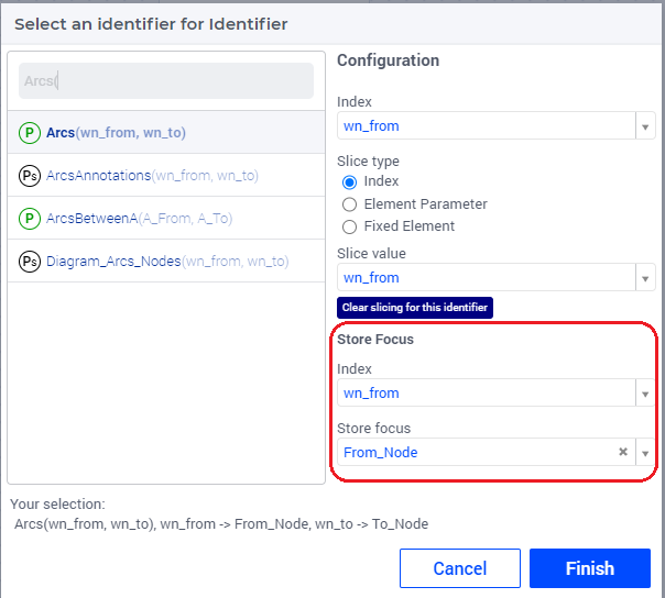
Identifier: A 2-dimensional binary parameter that defines the arcs between the respective source and destination nodes. While configuring this, you can also set the Store Focus element parameters info.
Label: A 2-dimensional string parameter that defines the label to be shown on the respective arcs. The label is displayed only when the specified text is non-empty.
The binary identifier filled in the “Identifier” field defines whether an arc is present (value 1) between two nodes or not (value 0). This works both ways: when adding an arc on the diagram, the identifier is updated in the model; and if you manipulate the identifier in the model, it will affect the arcs present on the diagram.
In particular, this binary identifier may have a domain condition specified in the model (for instance, by using another binary parameter with the same domain). Depending on the value of that domain condition, an arc may exist (if the domain condition is “true”) or not (if the domain condition is “false”). So, this is a special case of manipulating the arc identifier in the model. If the tuple of an arc has domain condition equal to “false”, then that arc cannot be drawn on the diagram.
More specifically, the diagram widget uses the domain condition of the arcs identifier as follows. In case a connection between two nodes in not in the index domain, the target node will not show any target feedback (i.e. a blue rectangle). In case a certain node cannot have any outgoing connection, it will not be possible to create a new arc starting from that specific node in the first place.
Custom Tooltips and Annotations for Arcs
When a user hovers over an arc, there is no tooltip displayed since the information is shown on the label. However, it is possible to also configure user-defined tooltips for the arcs by adding the webui::TooltipIdentifier` annotation attribute to the identifier specified as the Arc “Identifier” option.
Additionally, you can add user annotations in your AIMMS model to style the corresponding arcs with CSS. This can be achieved by adding the webui::AnnotationsIdentifier annotation attribute to the “Identifier” identifier. For more details on supported CSS properties, please refer to the CSS properties supported for annotations section.
Store Focus, Hover and Select for Arcs
Similar to the nodes, arcs also support the store focus functionality. This means that when an arc is selected by clicking it on the diagram, you can store the value of the nodes that the arc was drawn between in element parameters declared in the model.
While adding the identifier for the arc set, you will notice an option for “Store focus”. Here, an element parameter can be specified for either one or both of the indices, which will store the value of the node(s) when an arc is selected upon clicking in the diagram.
Ordering and Deleting Node Sets
You can adjust the order of the configured node sets by hovering over the title bar of the set and then clicking on the respective buttons to move it up or down. To delete an entire node set, simply click on the delete icon. These options are depicted in the image below:
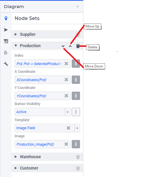
The order of the node sets in the options editor determines the arrangement of the “Add Node” buttons placed on the bottom of the diagram.
Miscellaneous Options
In the Miscellaneous section of the options editor, you’ll find several options:
Here is an explanation of each option:
Visible: Specify whether the widget should be visible on the page. This option can also be controlled using a model identifier.
Title: Define a title to be displayed at the top of the widget. This option can also be controlled using a model identifier.
Center: The “Center” option is divided into two sub-options: “Center.x” and “Center.y”. By setting the Center X and Y values, the initial display will start from that specific “Center” point. This option can also be controlled via identifiers in the model.
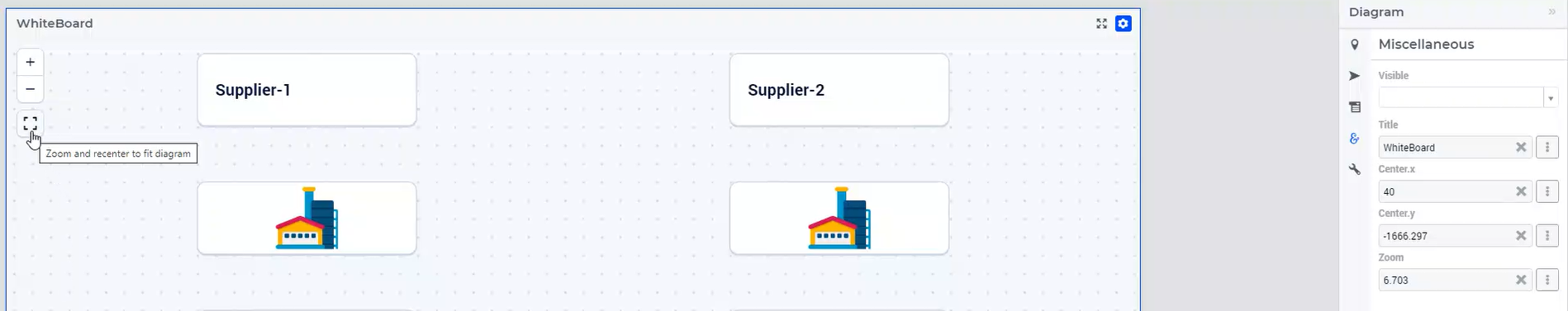
Zoom: Set an initial zoom level or control it via an identifier. When the diagram loads for the end user, it starts off at the defined zoom level. The zoom level can range from 1 (maximum zoom out) to 10 (maximum zoom in). Use the “Fit To Zoom” button on the canvas to adjust the zoom level to neatly fit the entire diagram within the viewport.
Adding a Node on the Diagram
Adding an Arc on the Diagram
Guidelines and Recommendations
For the Diagram widget to render arcs over nodes from different node sets, we recommend including a super set in your model that encompasses all of your Node Sets Set identifiers.Ensure that the Arc-related identifiers are indexed over this super set to enable seamless rendering of arcs between nodes from different sets (so, for example, from a warehouse to a customer).The Diagram widget is best added to a bigger widget area to provide ample space for the representation of nodes and arcs.Ensure that nodes are adequately spaced out to prevent excessive overlapping of arcs, which can impede intuitive inspection and comprehension.Editing Node information or Arc label information can be facilitated on a dialog page, which can be invoked through the item actions appearing on right-click of the respective Node/Arc.The delete action for a Node or Arc can be facilitated through the right-click item actions on the respective Node/Arc.When utilizing the Zoom and Center options, ensure that the values for these identifiers are defined as Initial Data and not Definitions(otherwise they would be read-only, effectively disallowing zooming and panning).It is recommended to use the “Fit To Zoom” button on the canvas to achieve the best fit for your entire diagram within the viewing area.